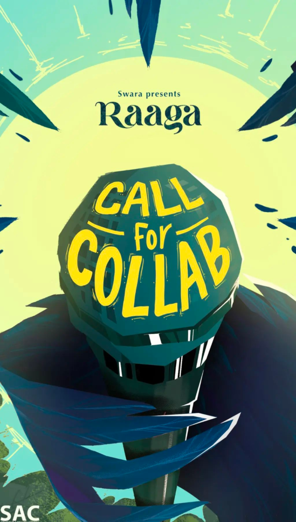
An identity that speaks; for an all India music festival
Raaga
Swara Team,
KL University
Identity design
Raaga is a national level music festival organised by SWARA, the official music club of K L University.
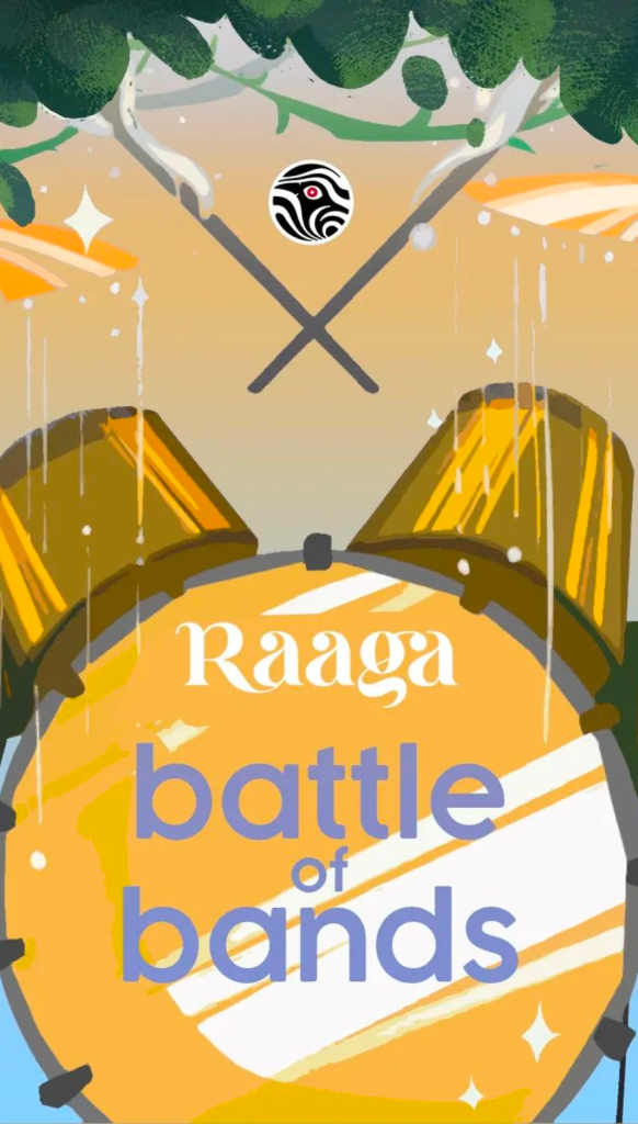
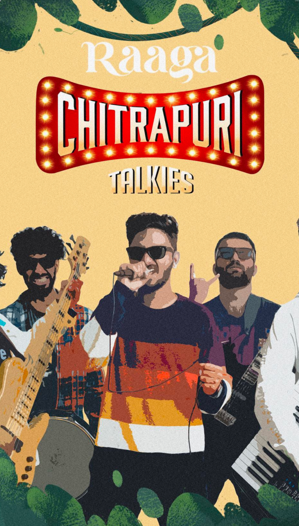
The music festival consists of several structurally designed components including various competitions, spot events and expos to celebrate music in different ways and to en- courage people to participate in areas of their liking, symbolising that music is for everyone.
Background
The project revolves around the organization of a music festival at the national level. This implies that the festival is a significant and large-scale event that draws participants and attendees from across the country.
SWARA is identified as the official music club of K L University, indicating that it is a student or organizational entity responsible for hosting the festival.
The festival comprises various structurally designed components, such as competitions, spot events, and expos, all aimed at celebrating music in diverse ways and encouraging people to participate in areas aligned with their preferences. This suggests that the festival is multifaceted and offers a range of activities related to music.
There are references to cultural and historical aspects related to music, such as the mention of poets like Kalidasa and Sarojini Naidu, who have celebrated music in their works. These references add depth and context to the project.
The background also touches upon the musical significance of the festival, highlighting the concept that all music is built upon seven basic notes or swaras. This concept underscores the universal nature of music and its ability to evoke emotions.
Strategy
Understand the Festival’s Identity: Began by thoroughly understanding the festival’s identity, mission, and values. This included understanding the diverse nature of music celebrated at the festival and its inclusive philosophy that music is for everyone.
Audience Analysis: Conducted an audience analysis to identify the primary target audience for the festival. This included music enthusiasts, students, professionals, and the general public. Understanding their preferences and expectations was crucial.
Conceptualize the Design: Developed a clear conceptual framework for the logo and logotype. Given the festival’s emphasis on the seven basic notes or swaras and its celebration of music’s emotional power, considered incorporating these elements into the design concept.
Visual Elements: Choose visual elements that resonate with the concept. This include cultural symbols, and abstract representations of music and emotions. Ensured that the design captures the excitement and energy of the festival while maintaining a polished appearance.
Color Palette: Selected a color palette that aligns with the festival’s spirit. Bright, vibrant colors can evoke excitement, while softer tones can convey the calming aspects of music. The choice of colors were considered based on cultural associations and symbolism.
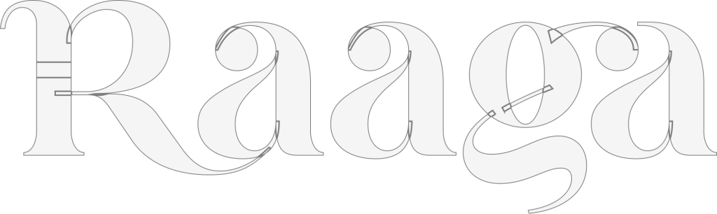
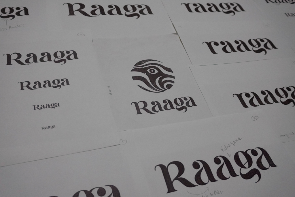
Typography: Carefully selected typography for the logotype that complements the visual elements. The typography is legible, modern, and versatile, allowing for different applications and sizes.
Versatility: Ensured that the logo and logotype are versatile and can be adapted for various uses, including digital media, print materials, merchandise, and signage. Created versions that work across different touchpoints.
Testing and Feedback: Share preliminary design concepts with key stakeholders, including members of SWARA and other members involved in the branding to gather feedback and make necessary adjustments.
Refinement and Finalization: Based on feedback and insights, refined the design until it effectively encapsulated the festival’s essence. Paid close attention to details, proportions, and overall aesthetics.
Design
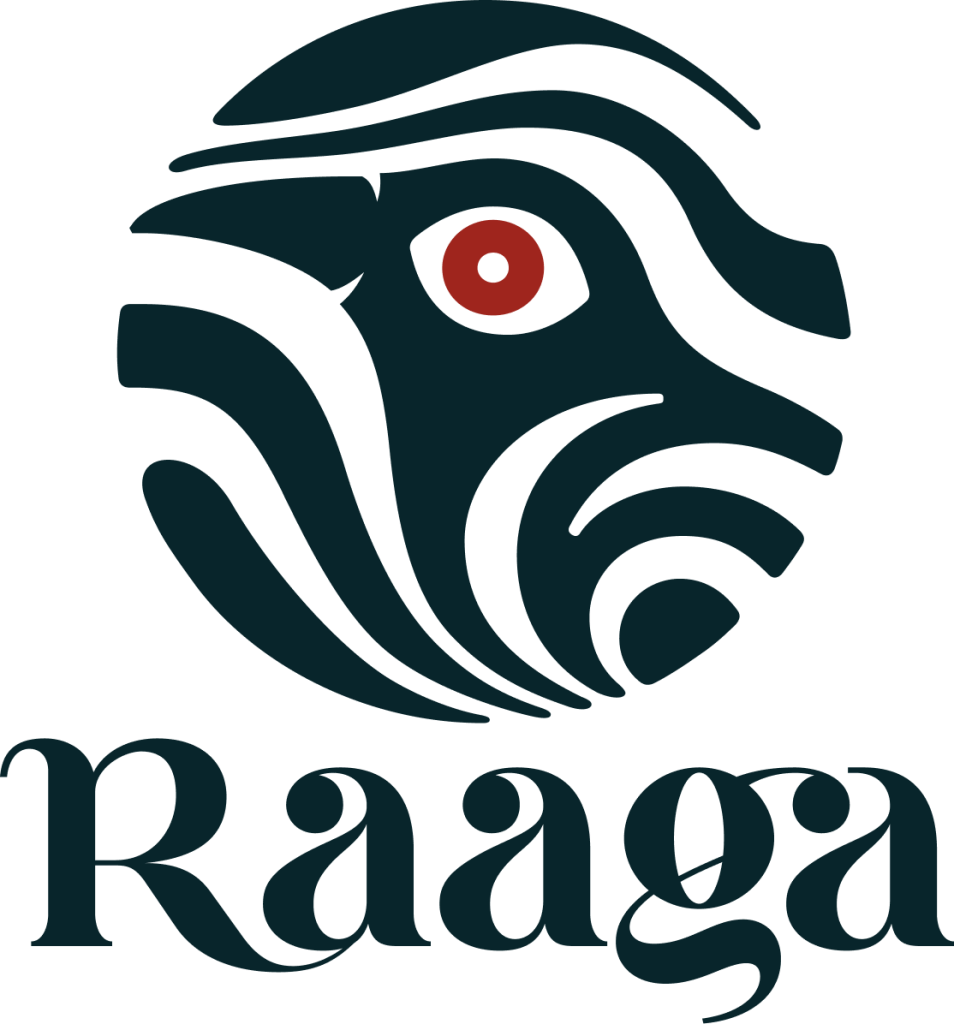
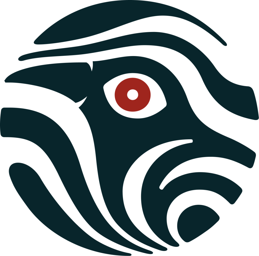
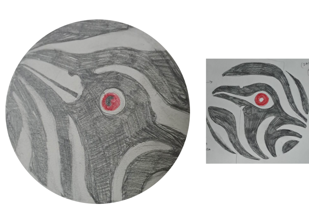
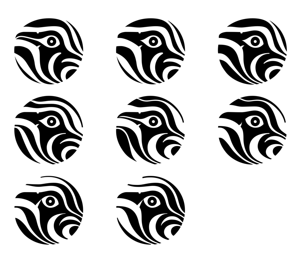
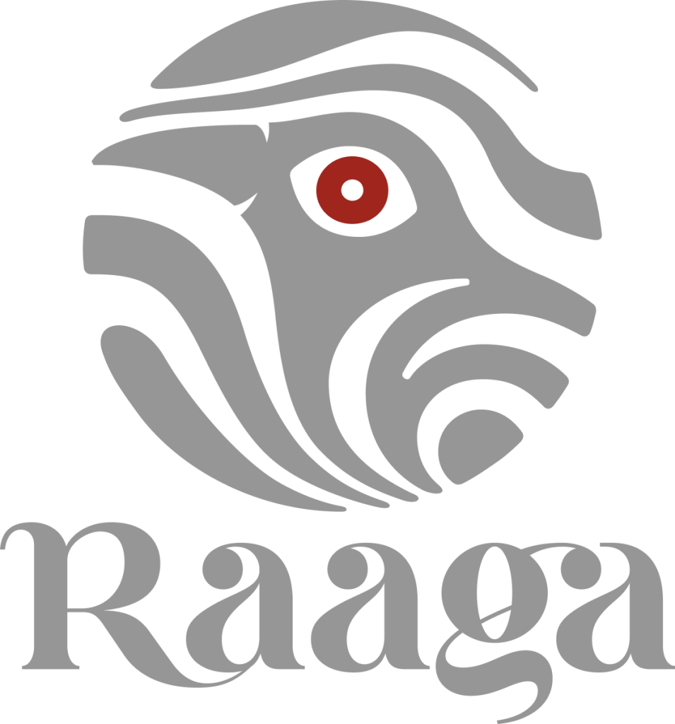
The logo for Raaga was made of seven white lines like the seven swaras that flow and make up any music in this world. These seven swaras pierce the world of music taking the physical form of a Koel.
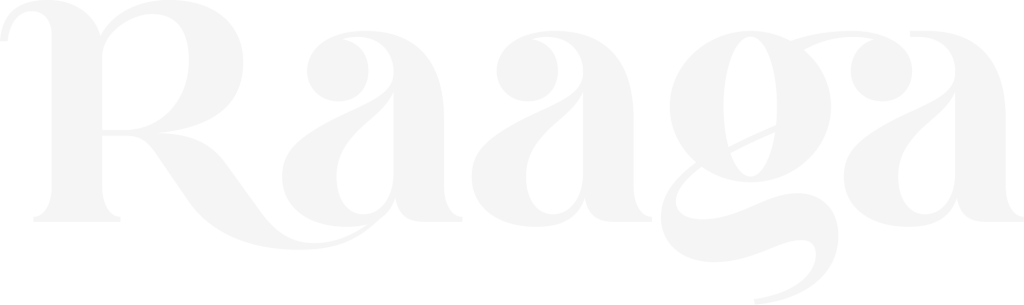
The Logotype for Raaga was made aptly to the theme of festival that is excitement and energetic. An apt design language was built for the festival.
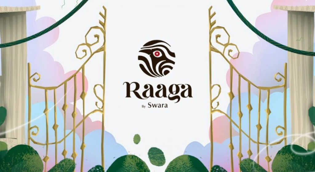
The Logo & the Logotype
Designed to evoke the excitement and energy of the festival, while still maintaining a professional and polished appearance.
They were aimed to be visually appealing and memorable, helping to create a strong brand identity for the festival.
Made to perfection
The Logo with a meaning
The Story
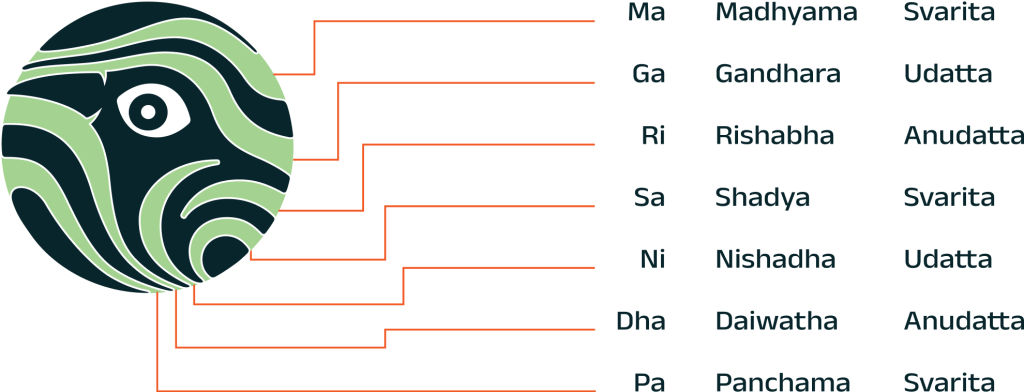
Have you ever noticed how music can evoke different emotions within you? Whether it’s the exhilarating feeling of a fast-paced song or the soothing calm of a soft melody, music has the power to move us in ways nothing else can. What’s interesting is that all music, no matter what genre or culture it belongs to, is made up of just seven basic notes or swaras – Sa, Re, Ga, Ma, Pa, Dha, and Ni.
These seven swaras form the building blocks of all musical compositions, and it’s fascinating to think that every song you’ve ever heard is essentially a unique arrangement of these seven notes. It’s almost like the world is a giant symphony, with each culture and genre adding its own unique flavor to the mix.
The Koel
A south Indian singing bird;
The great poet Kalidasa had noticed that koels sang with great abandon at the gathering of the monsoon clouds and so devoted a paean to this bird in his epic poem Meghadhoot. And in contemporary Indian history, one of our popular poets, Sarojini Naidu had won popular encomium as “The Nightingale of India” presumably because of the lyricism in her poetry.

The musical sphere
The circle is a universal symbol that has been used for thousands of years to represent wholeness, completeness, and infinity. The circle has no beginning or end, and it’s a shape that is found everywhere in nature – from the sun and moon in the sky to the rings of a tree trunk.
When we see a circle, we instinctively understand that it represents something that is continuous and unbroken, just like the music itself. Making the logo for Raaga circular, sends a message that their reach and impact is vast and all encompassing, just like the circle that represents the world.
Custom Made
Type Mark
The logotype features a modern and versatile typography style. The constructed typeface is sleek and legible, making it suitable for a wide range of applications, from digital media to print materials and merchandise.
The composition is dynamic and visually engaging. It may incorporate elements that evoke musical movement, such as flowing lines or curves, to symbolize the way music flows and transforms.
Usage
In different scenarios
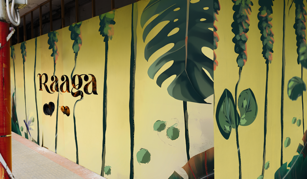
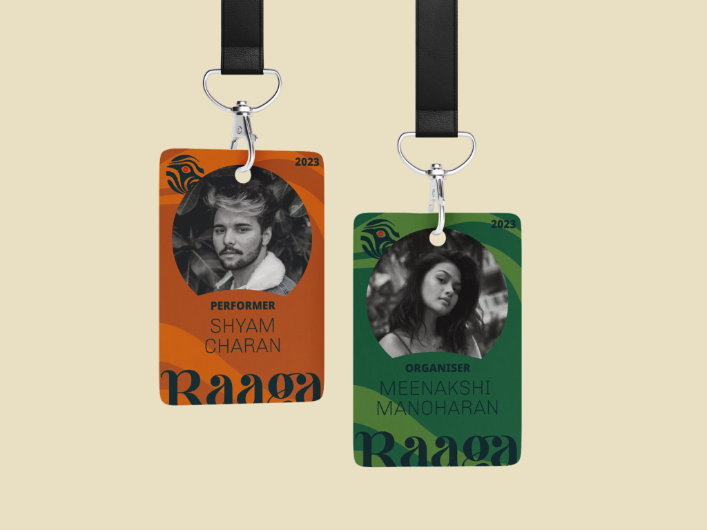
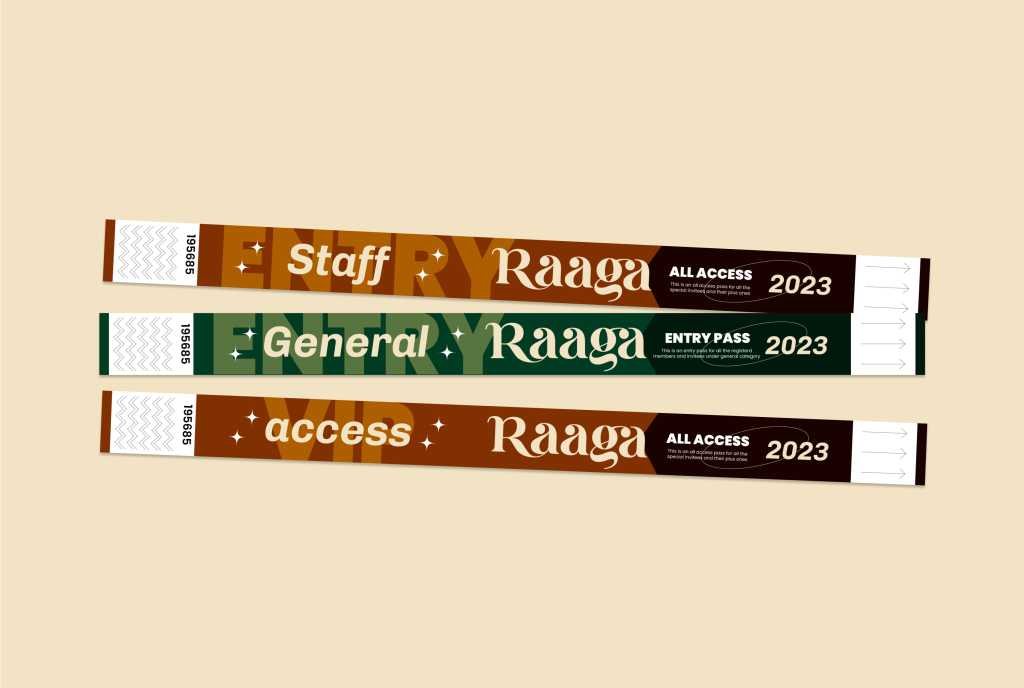
Usage in
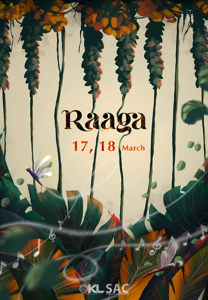
Marketing Material
Credits to Swara Team, KL University and NID team
Early sketches and process
It all started with an idea
During discussions with the client, a significant aspect of the project came to the forefront. This music festival is deeply rooted in Indian culture, with its theme centered around the rich heritage of historical music and the diverse musical traditions from different regions of India, all brought into the context of the modern era.
Key highlights from the conversation with the client included a profound emphasis on the foundational elements of music, represented by the seven swaras, as well as the cultural significance of the melodious Koel bird in Indian music and folklore. These aspects stood out prominently and are expected to play a central role in the festival’s narrative and overall experience.
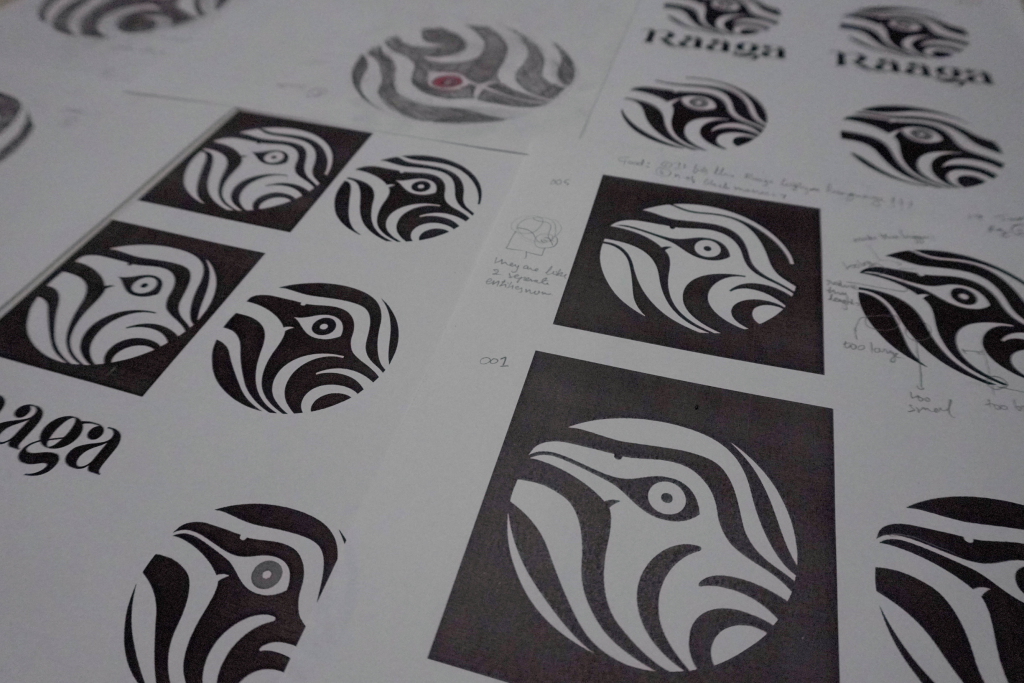
The character of Koel was studied through different lenses. Different types of sketches ranging from cartoonic to very detailed artworks were explored. Needless to say, getting the silloutte of a Koel was a challenge.
Visual Design
Integrating ideas
The incorporation of the two concepts, swaras and the Koel, into the festival’s identity received an enthusiastic and positive response from both the client and the participants. However, a notable challenge was faced in seamlessly integrating the representation of the seven swaras into the festival’s mascot.
Taking into account the psychological aspects of the event and the preferences of the target market, the decision was made to create a somewhat minimalist logo. This design approach focuses on clean lines, smooth edges, and seamless integration between the elements and the background. The objective is to craft a visually engaging logo that not only captures interest but also sets the festival apart from similar events and identities in the music festival landscape.
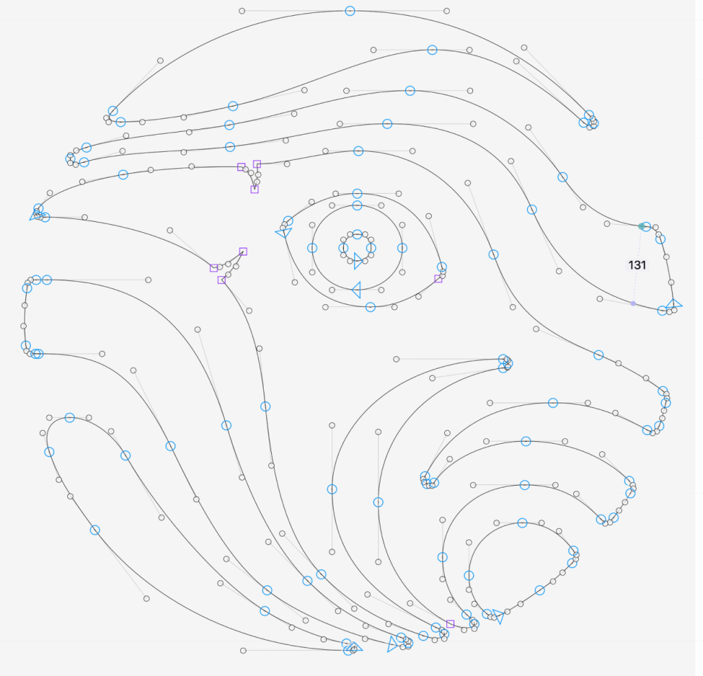
Construction & Testing
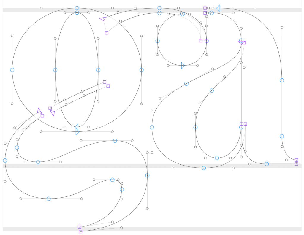
The logo was constructed visually to give it an organic look. It went through several iterations of design and testing on several media to understand and develop how it works.
A logotype that can go with the identity was also ideated and designed; A bubbly text with ornamental strokes leading out of the form with circular bouncy bulbs and ligatures were constructed. The logotype is inspired by nature.
Credits >
Introduction Video:
Nabeel https://www.instagram.com/nabeelnahiyan/
Social media posts and illustrations:
Gauri and Team https://www.instagram.com/koochipooo/
Project Details
Raaga
Swara Team,
KL University
Identity design
Background
The project revolves around the organization of a music festival at the national level. This implies that the festival is a significant and large-scale event that draws participants and attendees from across the country.
SWARA is identified as the official music club of K L University, indicating that it is a student or organizational entity responsible for hosting the festival.
The festival comprises various structurally designed components, such as competitions, spot events, and expos, all aimed at celebrating music in diverse ways and encouraging people to participate in areas aligned with their preferences. This suggests that the festival is multifaceted and offers a range of activities related to music.
There are references to cultural and historical aspects related to music, such as the mention of poets like Kalidasa and Sarojini Naidu, who have celebrated music in their works. These references add depth and context to the project.
The background also touches upon the musical significance of the festival, highlighting the concept that all music is built upon seven basic notes or swaras. This concept underscores the universal nature of music and its ability to evoke emotions.
Strategy
Understand the Festival’s Identity: Began by thoroughly understanding the festival’s identity, mission, and values. This included understanding the diverse nature of music celebrated at the festival and its inclusive philosophy that music is for everyone.
Audience Analysis: Conducted an audience analysis to identify the primary target audience for the festival. This included music enthusiasts, students, professionals, and the general public. Understanding their preferences and expectations was crucial.
Conceptualize the Design: Developed a clear conceptual framework for the logo and logotype. Given the festival’s emphasis on the seven basic notes or swaras and its celebration of music’s emotional power, considered incorporating these elements into the design concept.
Visual Elements: Choose visual elements that resonate with the concept. This include cultural symbols, and abstract representations of music and emotions. Ensured that the design captures the excitement and energy of the festival while maintaining a polished appearance.
Color Palette: Selected a color palette that aligns with the festival’s spirit. Bright, vibrant colors can evoke excitement, while softer tones can convey the calming aspects of music. The choice of colors were considered based on cultural associations and symbolism.
Typography: Carefully selected typography for the logotype that complements the visual elements. The typography is legible, modern, and versatile, allowing for different applications and sizes.
Versatility: Ensured that the logo and logotype are versatile and can be adapted for various uses, including digital media, print materials, merchandise, and signage. Created versions that work across different touchpoints.
Testing and Feedback: Share preliminary design concepts with key stakeholders, including members of SWARA and other members involved in the branding to gather feedback and make necessary adjustments.
Refinement and Finalization: Based on feedback and insights, refined the design until it effectively encapsulated the festival’s essence. Paid close attention to details, proportions, and overall aesthetics.
Design
The logo for Raaga was made of seven white lines like the seven swaras that flow and make up any music in this world. These seven swaras pierce the world of music taking the physical form of a Koel.
The Logotype for Raaga was made aptly to the theme of festival that is excitement and energetic. An apt design language was built for the festival.