Creating an unified drag and drop UI Design system for the developers that use the ONDC platform
ONDC Grid
Guided by
Prof. Venkatesh R
Collaborators
Utkarsha
Anoushka Shome
UI Design
Design Systems
The Open Network for Digital Commerce (ONDC) is a Government of India initiative aimed at democratizing e-commerce. Much like UPI did for digital payments, ONDC creates an open, interoperable network where buyers, sellers, and service providers can connect across platforms. By replacing platform monopolies with a shared digital infrastructure, ONDC enables fair participation, transparency, and scalability for businesses of all sizes, from local vendors to large enterprises.
This is system is part of a 2 week course. Being a student of Communication Design in the past, I really enjoyed this module because of the layouts and grids explorations.
Background
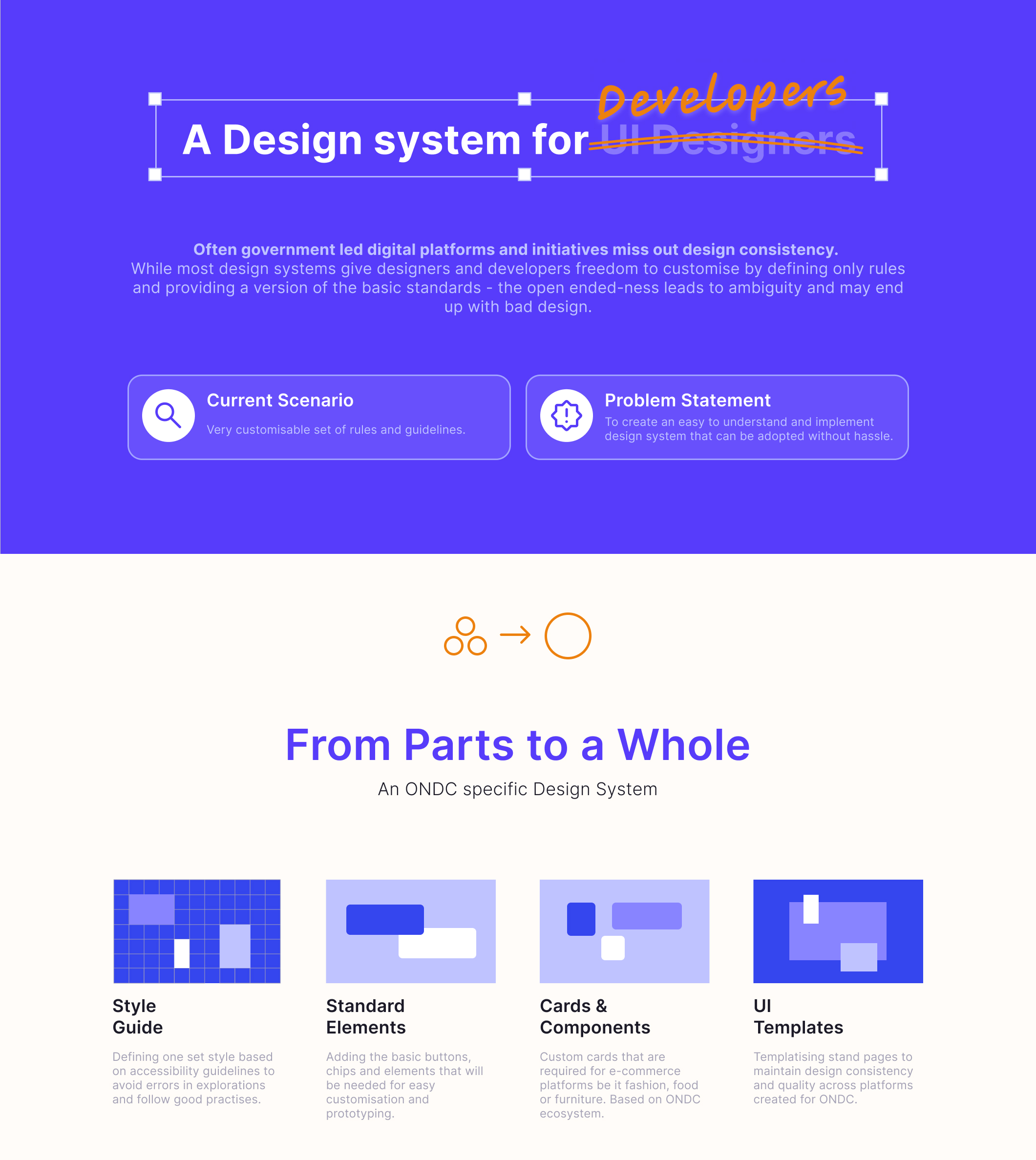
In many government-led digital platforms, design consistency often takes a back seat. While most design systems give designers and developers broad freedom by defining only rules and base standards, this openness frequently leads to ambiguity and inconsistent results. During this project, I explored how a design system could be built specifically for developers, not just for UI designers. This is to ensure better adoption, consistency, and accessibility across the ONDC (Open Network for Digital Commerce) ecosystem.
Strategy
I studied existing government digital platforms and their design systems to understand where inconsistencies stemmed from. Particularly the balance between flexibility and structure was understood. The goal was to develop a comprehensive yet restrictive system: easy to understand, quick to implement, and structured enough to prevent design drift.
The process involved:
- Mapping how developers currently interpret and use design guidelines.
- Identifying where ambiguity arises in visual or interaction patterns.
- Translating accessibility and usability standards into non-negotiable visual rules.
- Iterating prototypes with developer feedback to ensure ease of implementation.
Design
The system was developed from the ground up—from basic visual rules to full interface templates—under the framework “From Parts to a Whole.” It includes:
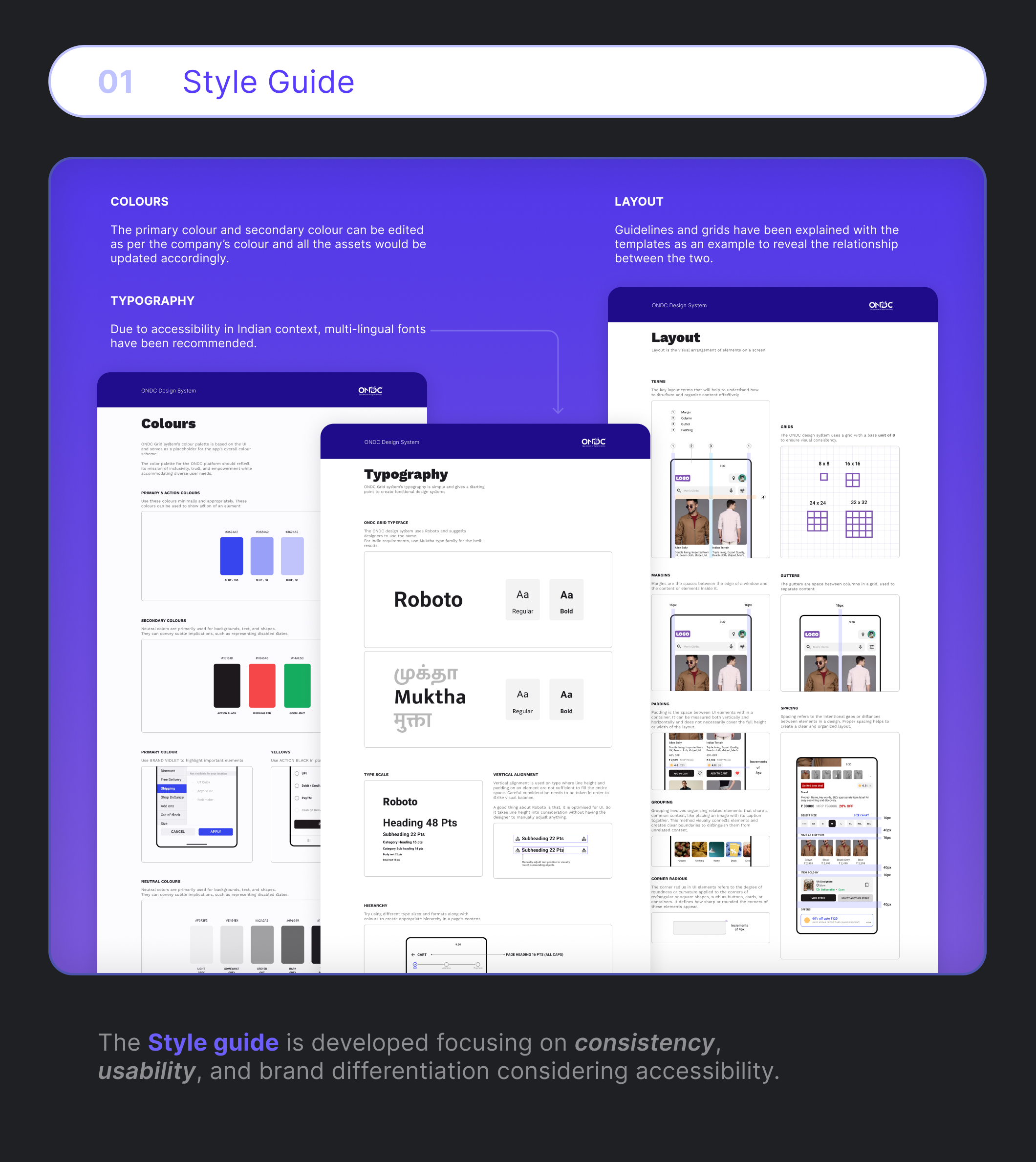
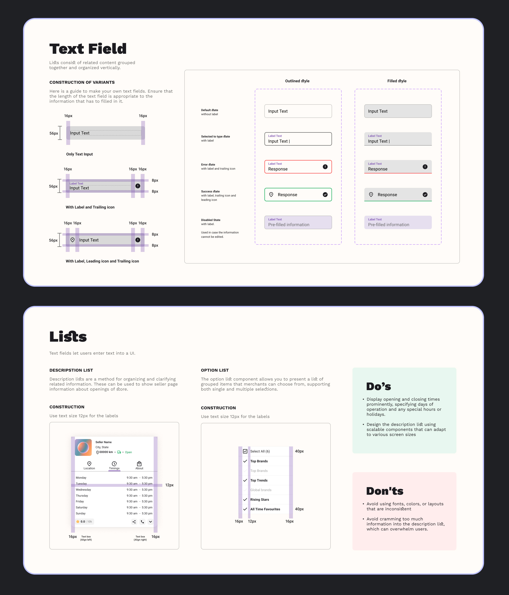
- Style Guide: Defines a single unified style rooted in accessibility guidelines to reduce exploration errors and ensure consistency.
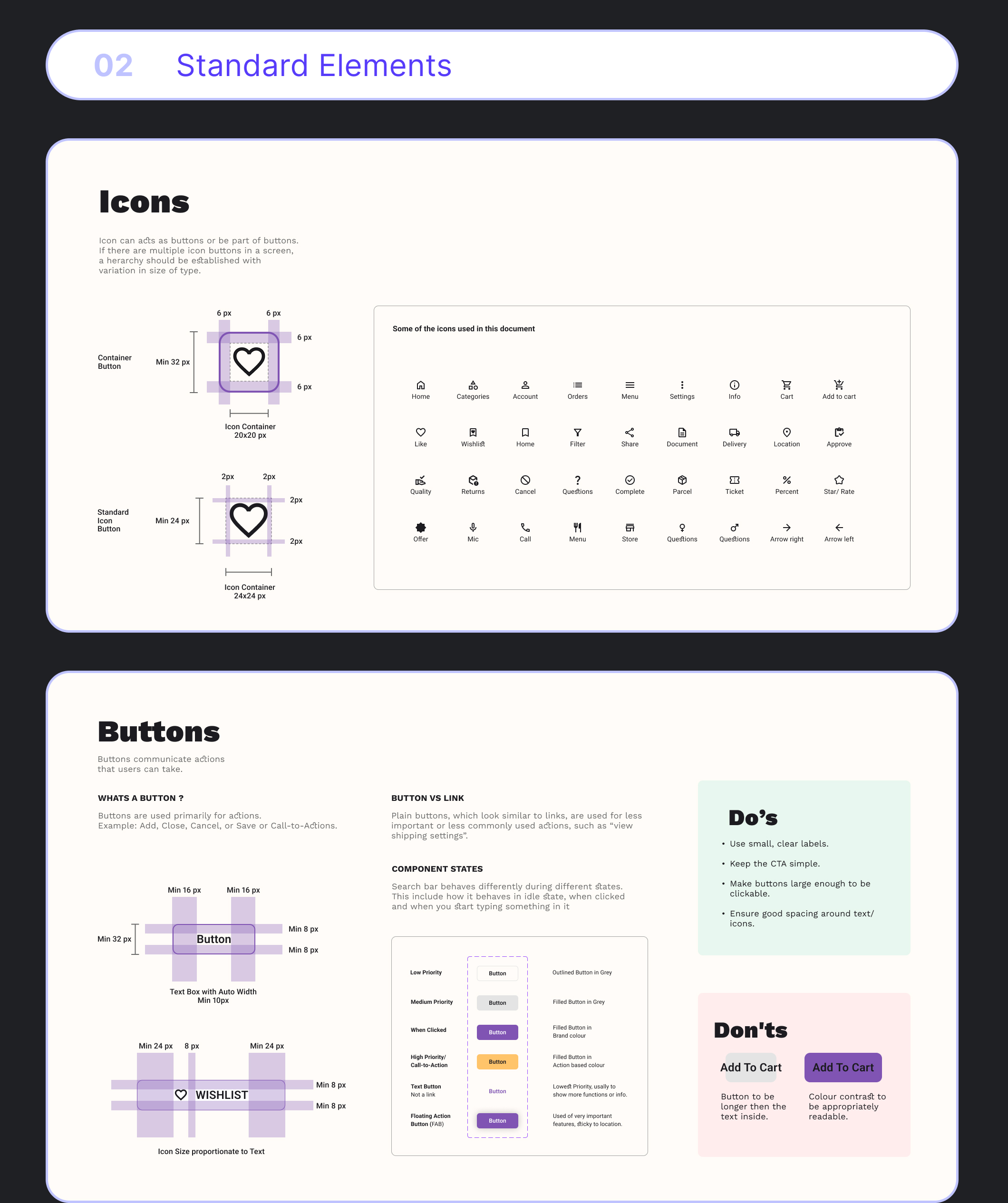
- Standard Elements: Core UI building blocks—buttons, chips, inputs—designed for easy reuse and prototyping.
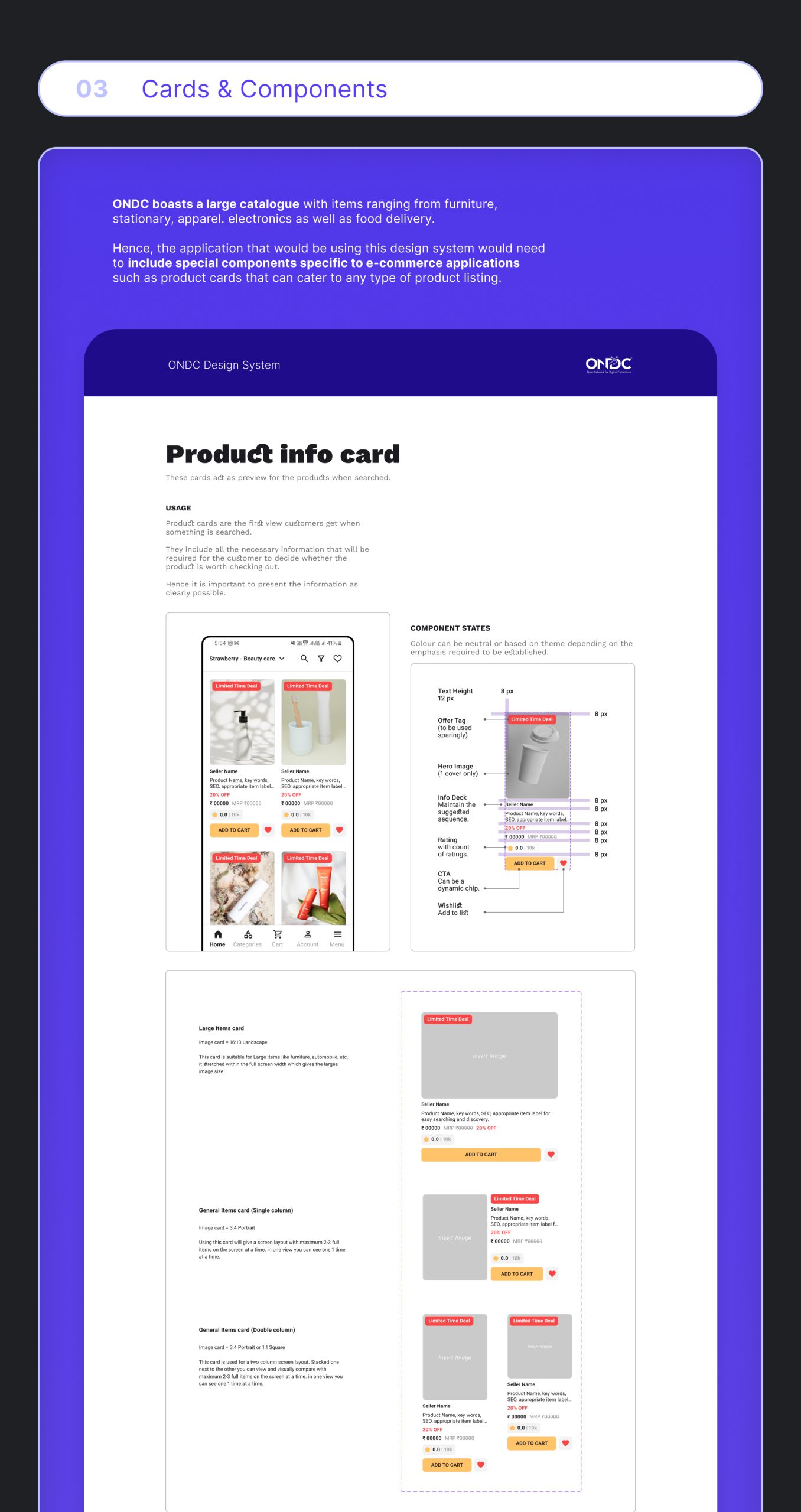
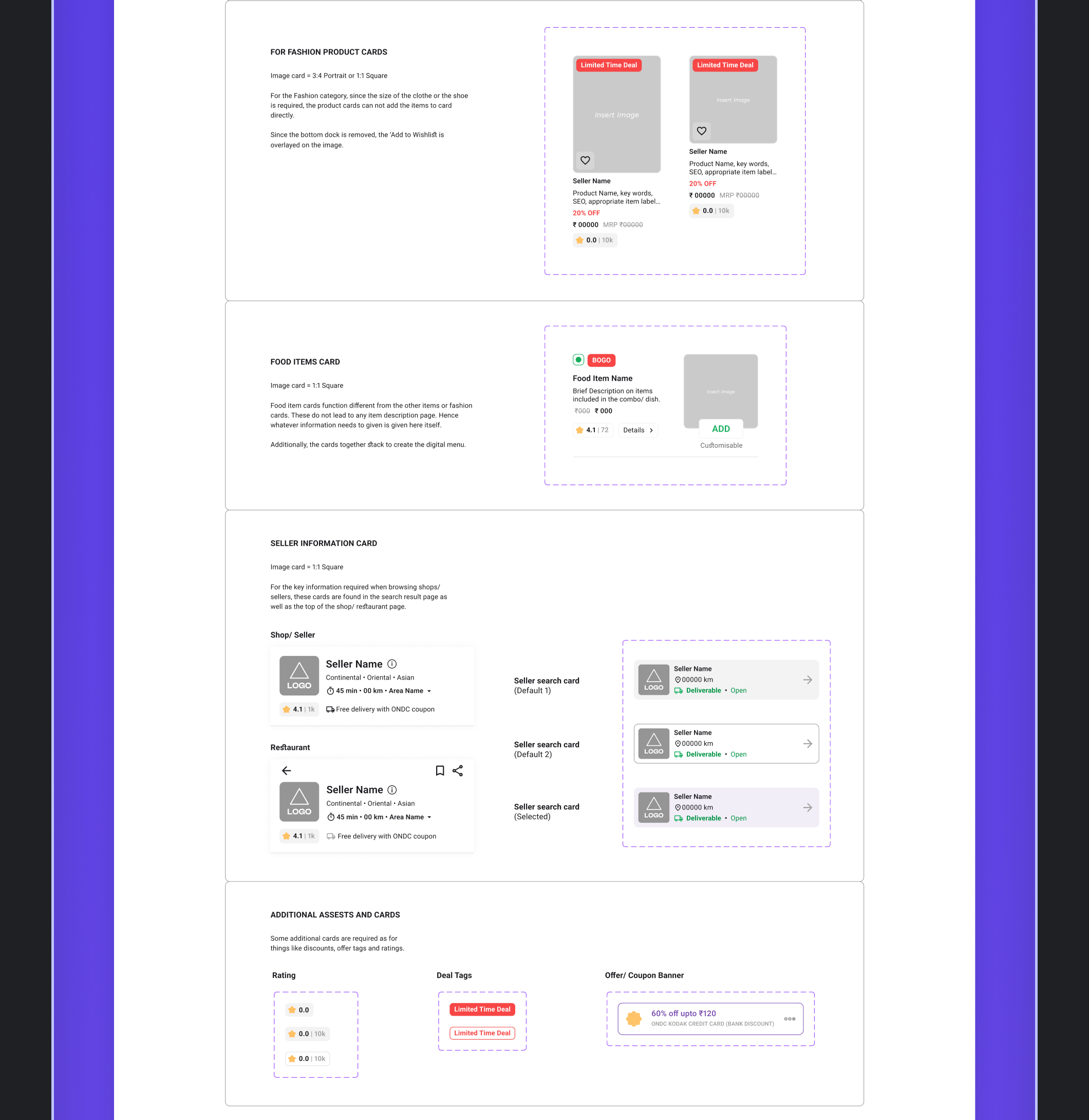
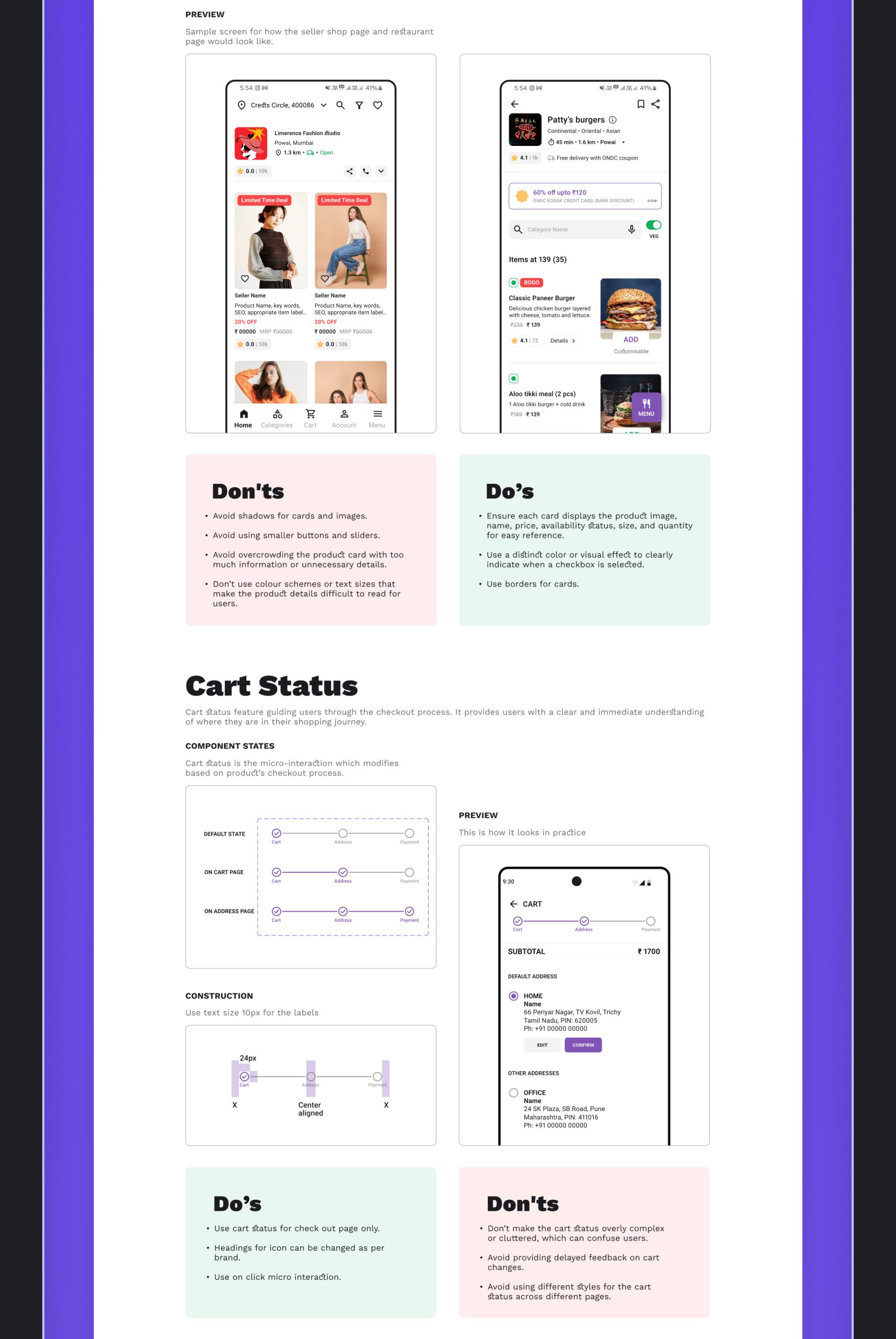
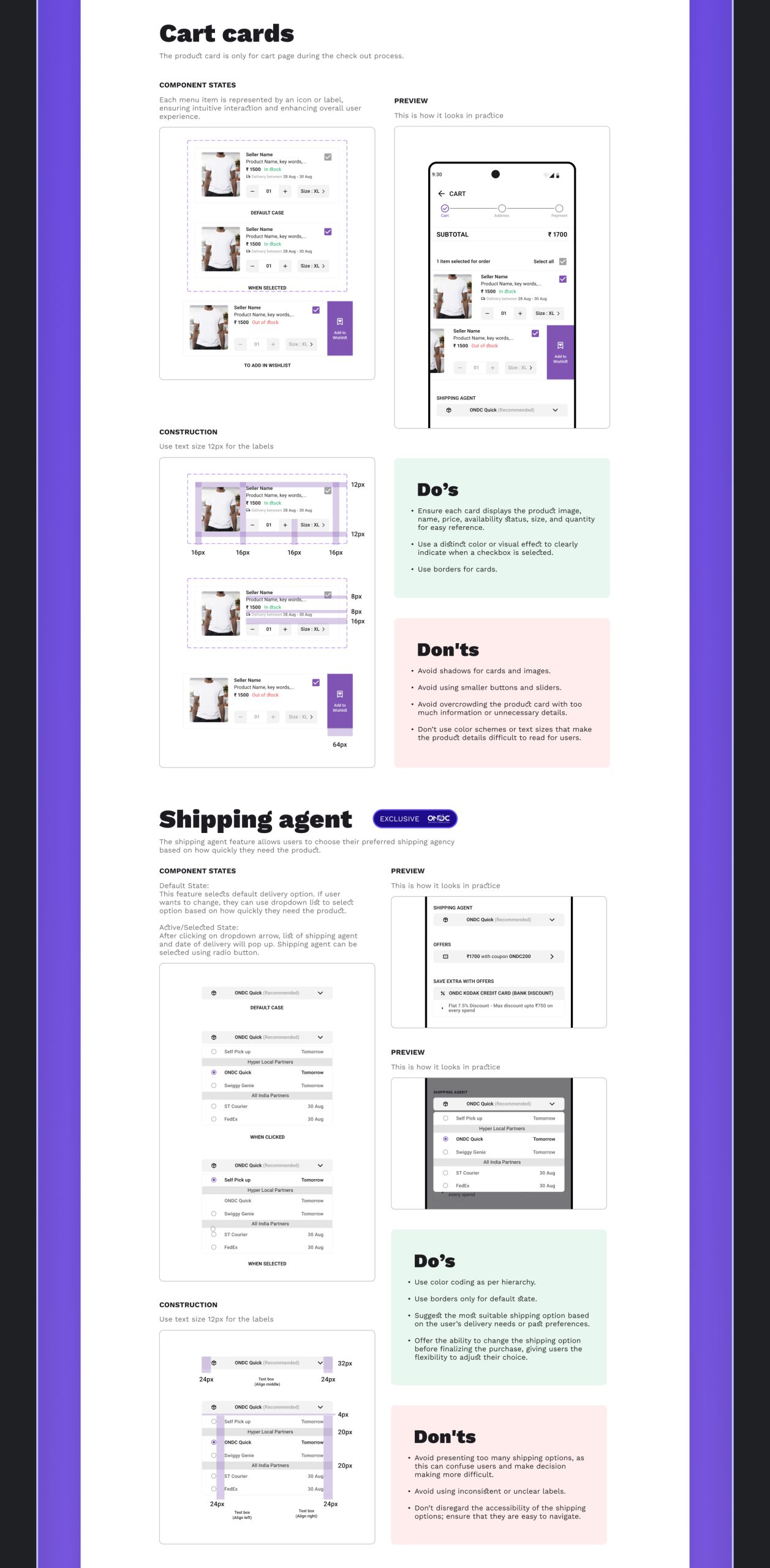
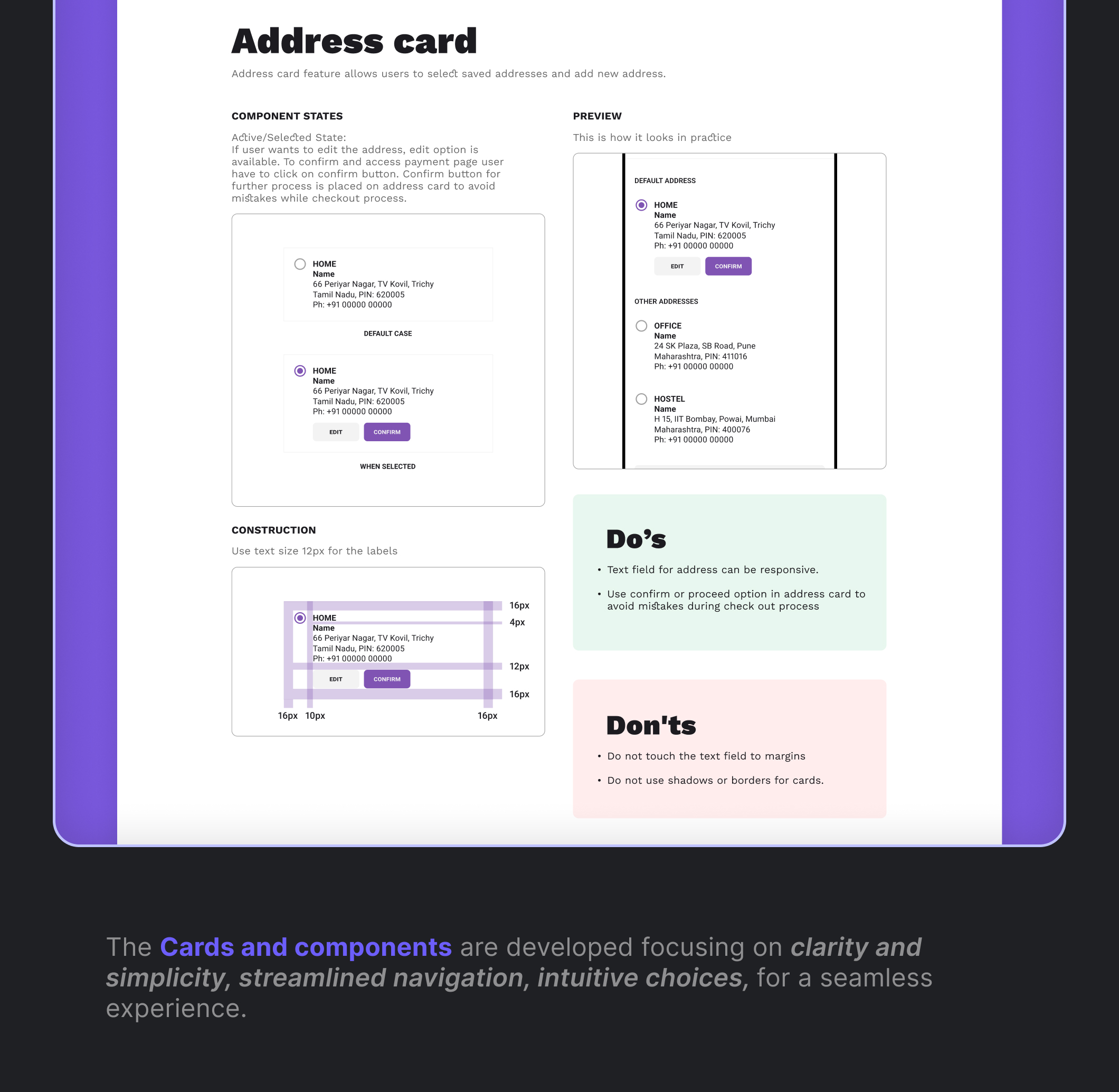
- Cards & Components: Custom card structures tailored for e-commerce use cases such as food delivery, fashion, or furniture, aligned with the ONDC ecosystem.
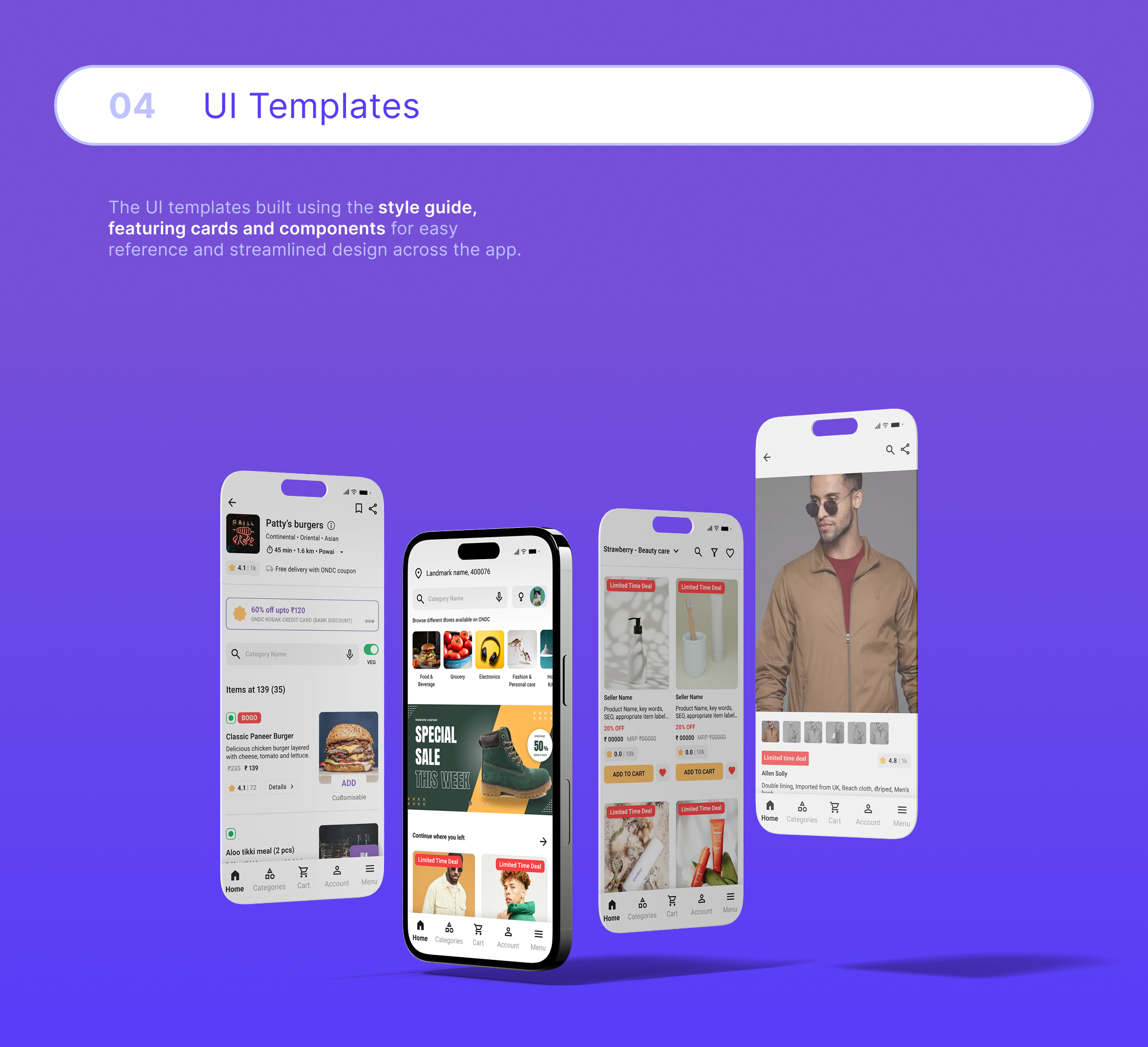
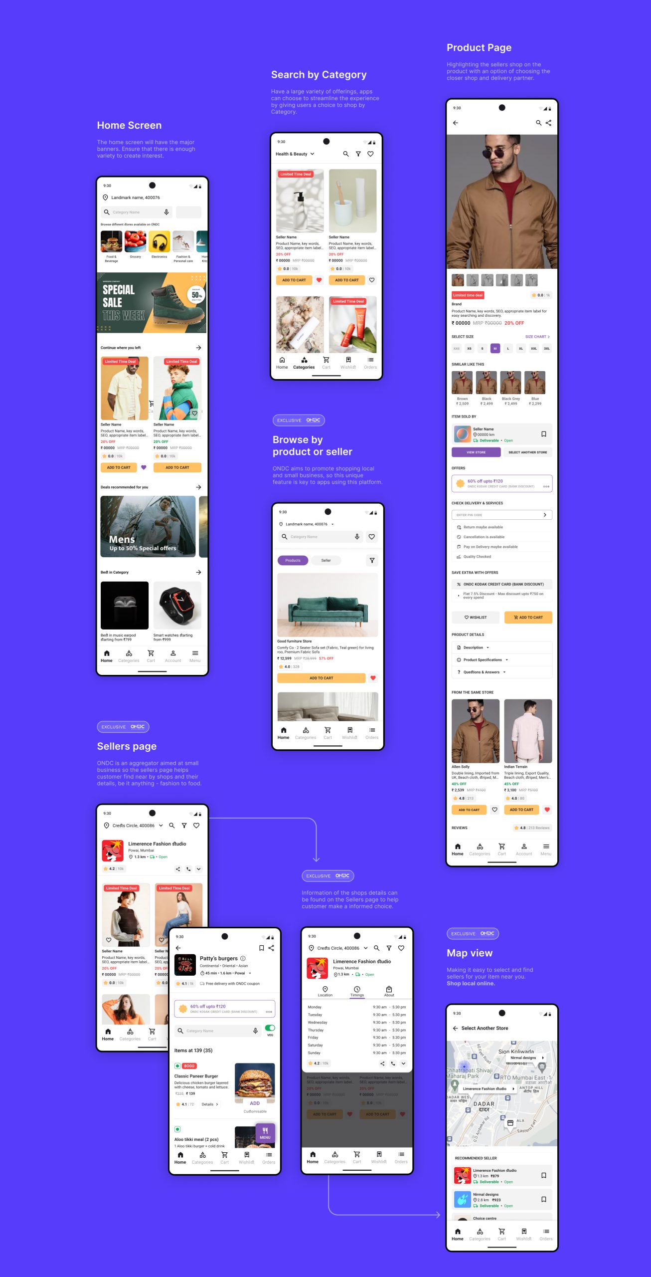
- UI Templates: Predefined screen templates to maintain quality and uniformity across multiple platforms built for ONDC.
Results
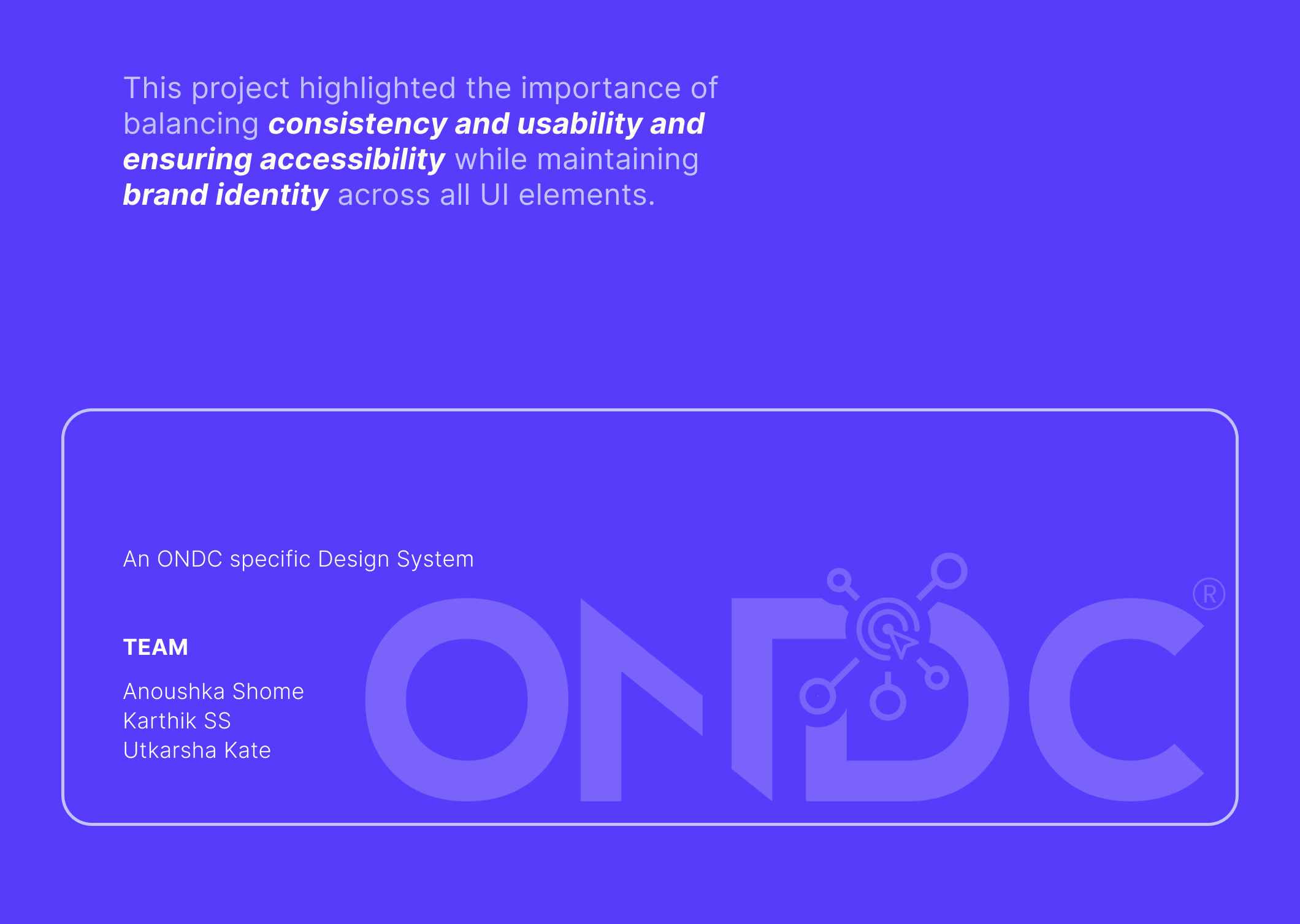
The ONDC-specific design system simplified the design-to-development handoff and reduced interface inconsistencies across partner platforms. Developers reported faster implementation and fewer design clarifications needed during integration. By prioritizing clarity, structure, and accessibility, the system ensures that even without deep design expertise, teams can produce consistent, high-quality digital experiences that align with ONDC’s visual and functional identity.
Project Details
ONDC Grid
Guided by
Prof. Venkatesh R
Collaborators
Utkarsha
Anoushka Shome
UI Design
Design Systems
Background
In many government-led digital platforms, design consistency often takes a back seat. While most design systems give designers and developers broad freedom by defining only rules and base standards, this openness frequently leads to ambiguity and inconsistent results. During this project, I explored how a design system could be built specifically for developers, not just for UI designers. This is to ensure better adoption, consistency, and accessibility across the ONDC (Open Network for Digital Commerce) ecosystem.
Strategy
I studied existing government digital platforms and their design systems to understand where inconsistencies stemmed from. Particularly the balance between flexibility and structure was understood. The goal was to develop a comprehensive yet restrictive system: easy to understand, quick to implement, and structured enough to prevent design drift.
The process involved:
- Mapping how developers currently interpret and use design guidelines.
- Identifying where ambiguity arises in visual or interaction patterns.
- Translating accessibility and usability standards into non-negotiable visual rules.
- Iterating prototypes with developer feedback to ensure ease of implementation.
Design
The system was developed from the ground up—from basic visual rules to full interface templates—under the framework “From Parts to a Whole.” It includes:
- Style Guide: Defines a single unified style rooted in accessibility guidelines to reduce exploration errors and ensure consistency.
- Standard Elements: Core UI building blocks—buttons, chips, inputs—designed for easy reuse and prototyping.
- Cards & Components: Custom card structures tailored for e-commerce use cases such as food delivery, fashion, or furniture, aligned with the ONDC ecosystem.
- UI Templates: Predefined screen templates to maintain quality and uniformity across multiple platforms built for ONDC.
Results
The ONDC-specific design system simplified the design-to-development handoff and reduced interface inconsistencies across partner platforms. Developers reported faster implementation and fewer design clarifications needed during integration. By prioritizing clarity, structure, and accessibility, the system ensures that even without deep design expertise, teams can produce consistent, high-quality digital experiences that align with ONDC’s visual and functional identity.