Improving Mumbai Local’s travel experience by redesigning the most used travel app of the city
m-Indicator
Guided by
Ms. Swati Pal
Collaborators
Krishna Aher
HFID
Eye Tracking
UX Evaluation
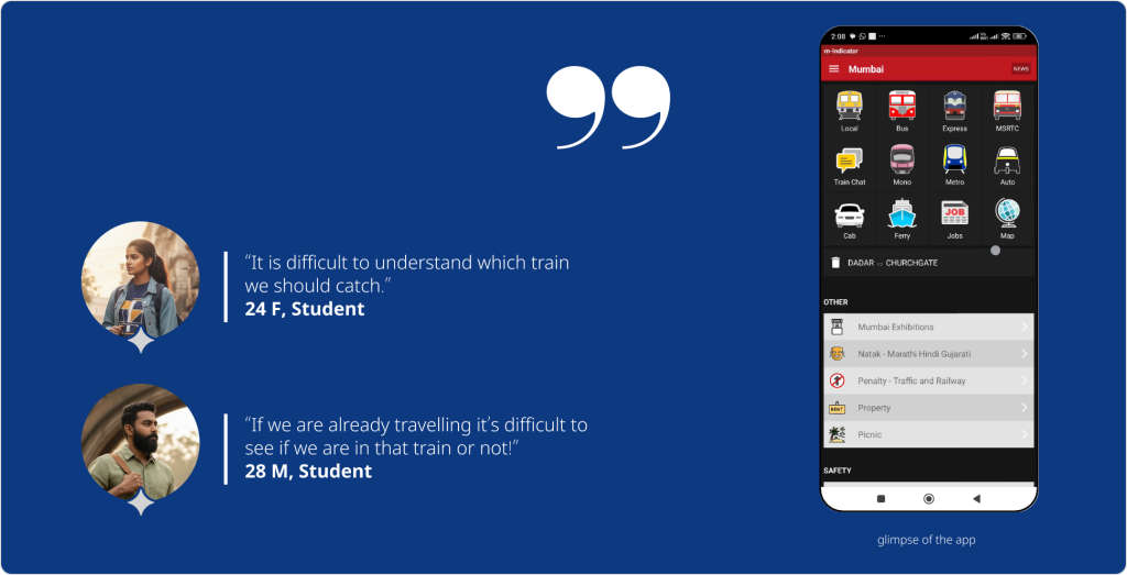
m-Indicator is the most used app in Mumbai for Local commute. There are several apps used by the traditional users but the emergent veteran users in Mumbai always preferred m-Indicator. But when traditional users try it, it’s a barrage of what is this, what is that, and why the heck something is some way.
We wanted to understand how is the cognitive pressure is on the contrary to popular beliefs in this specific app that the emergent users prefer it while the traditional users struggle.
With this in mind, we wanted to see how we can make it accessible for the traditional users with minimum changes, thus not affecting the huge expert user-base.
See how fast you are able to do the regular tasks that emergent users do on a daily basis.
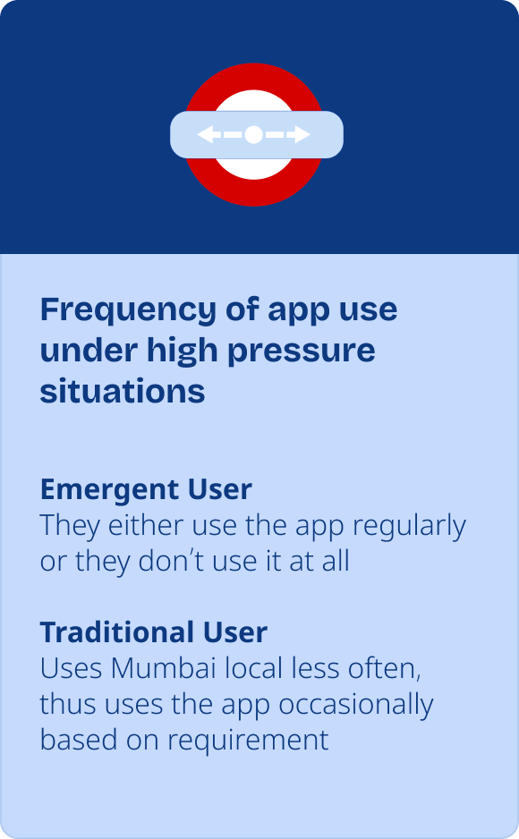
Emergent user
Individuals who are new to using modern information and communication technologies (ICTs), especially those who are disadvantaged by limited education, lower income, or cultural differences.
Traditional user
In the context of technology adoption and user experience design, a traditional user is a person who has had extensive, long-term exposure to and experience with technology.
Background
During the 2nd semester of Interaction design course at IDC, IIT Bombay, I got to explore how humans interact with systems physically, cognitively and emotionally to understand how products can be designed to fit human abilities and limitations.
Strategy
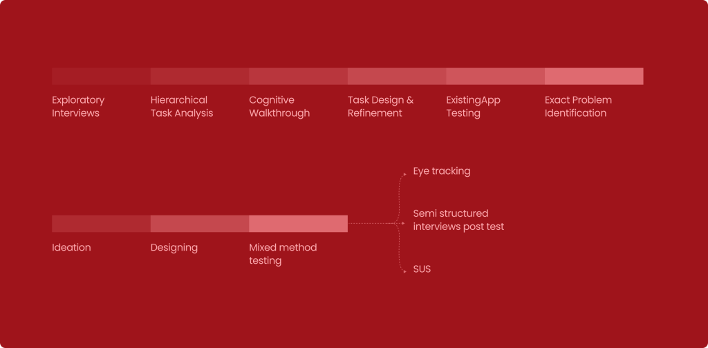
Conducted exploratory interviews, studied user actions, applied cognitive load theory, Don Norman’s Action analysis, hierarchical task analysis (HTA), cognitive walkthroughs, and user testing with redesigned prototypes. Compared traditional (educated but less adaptable) vs emergent (less formally educated but adaptable) users. This study explores how minimal design changes can significantly impact decision-making while using the m-Indicator app.
Design
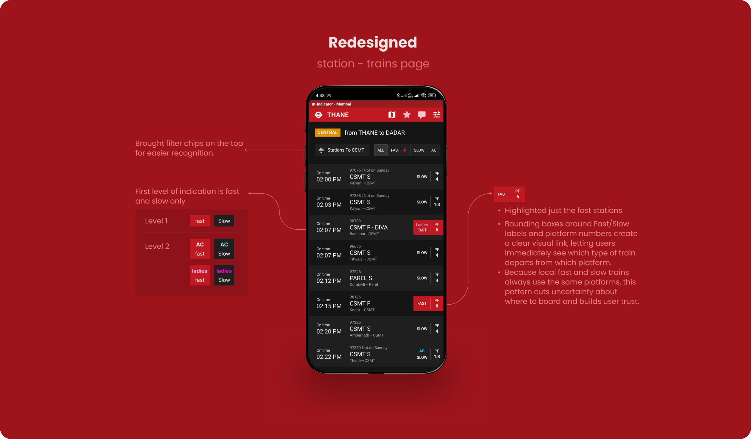
Major redesign included clearer route overviews, visible platform information, better labeling of train types (fast/slow/AC), and improved call-to-action buttons (CTAs).
Results
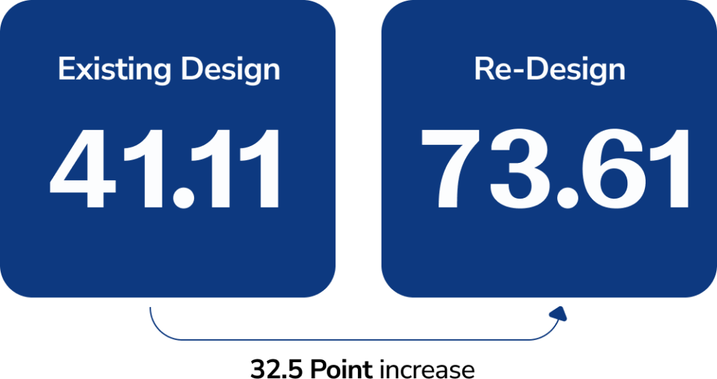
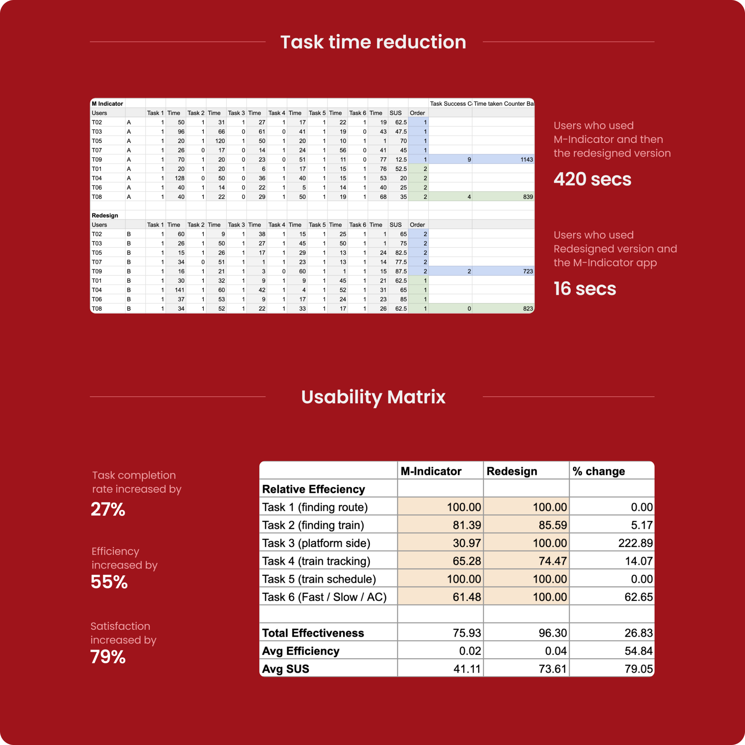
Users were asked to perform train-related tasks (like finding routes, checking live train status, etc.). We conducted a within-subject study comparing existing vs redesigned versions. We used eye-tracking, SUS (System Usability Scale), and qualitative interviews and found major improvements in task completion rate (+27%), efficiency (+55%), and satisfaction (+79%).
Small layout and labeling changes can meaningfully improve navigation confidence.
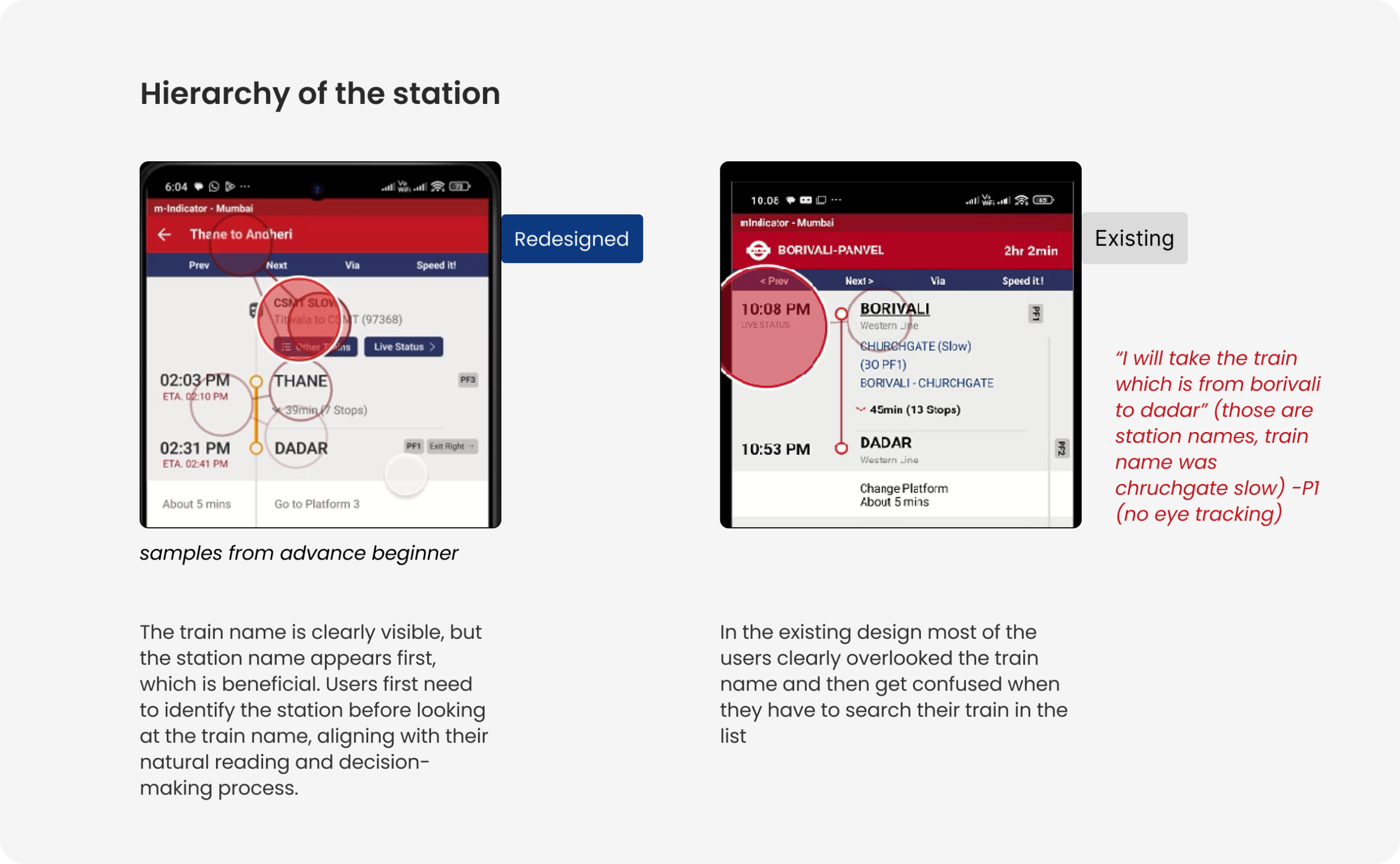
We found that Low-familiarity users indeed struggled with text-heavy searches and unclear visual hierarchy. The struggle greatly improved on rectifying the issues.
Corridor-based and visually structured information helps overcome literacy barriers.
Ai Disclosure

Images that were created using AI will be explicitly marked with an AI mark under them. Some content have been structured using Ai.

Ai is NOT used in the creation of any of the case study’s content nor in analysing the user data.

You can skip to the solutions directly
Motivations of the study
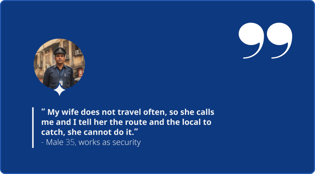
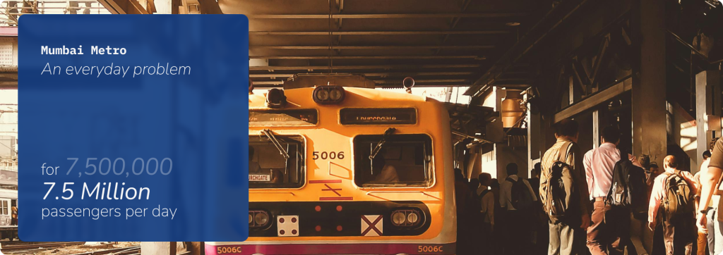
Mumbai local commuters need to make quick decisions about train schedules, routes.
Live tracking is used by people to plan their journey
The Design Process Followed
Understanding initial Interviews
Design Process: Whiteboard Analysis
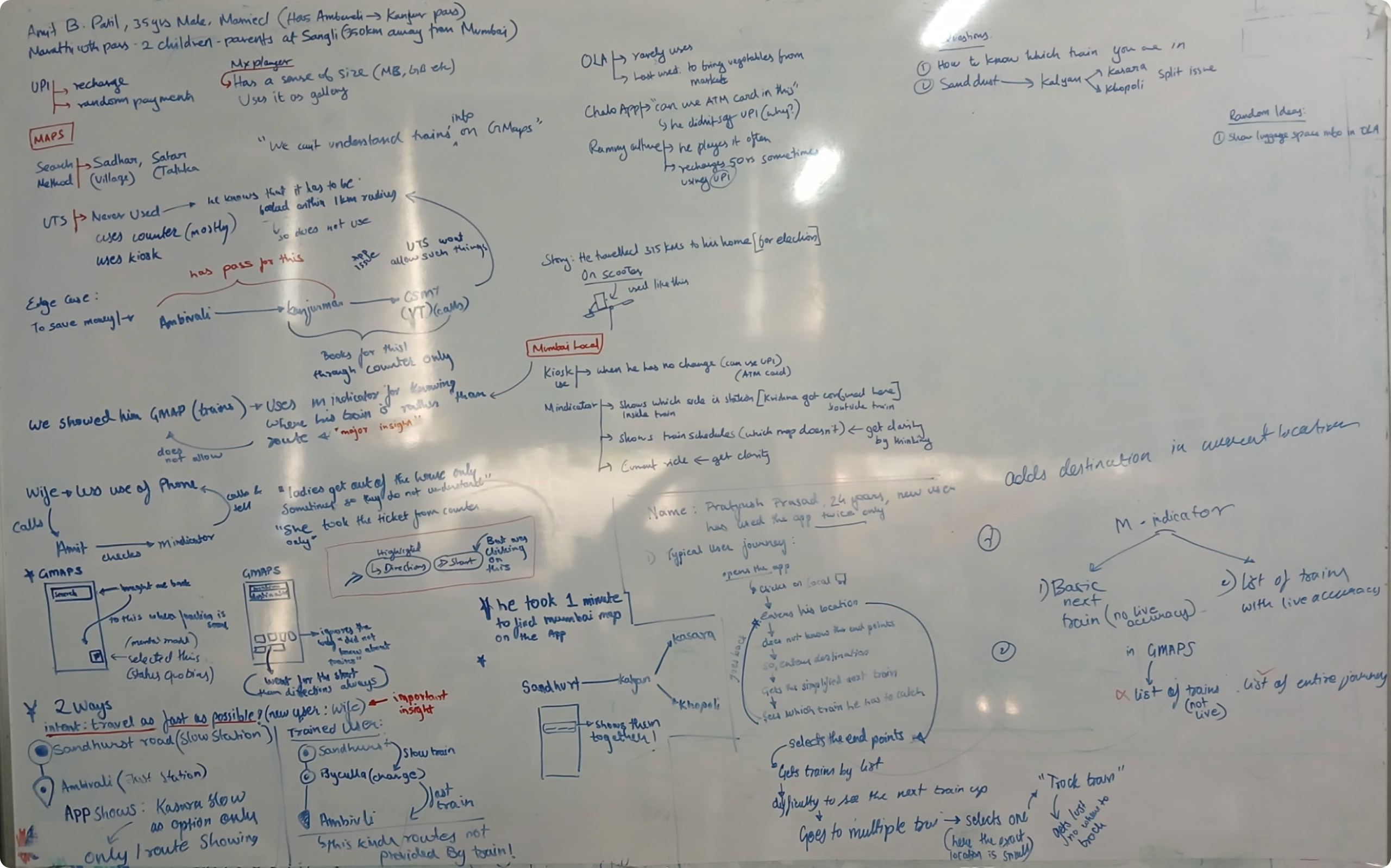
Understanding the problem
The app is difficult for users who are originally not from Mumbai
Why is this?
Based on the observations above,
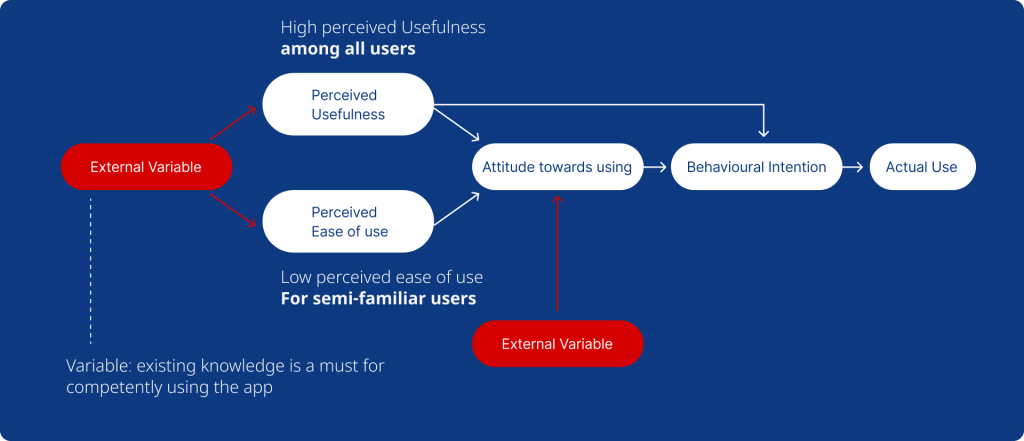
Devanuj et al User usage model for technology adoption for users
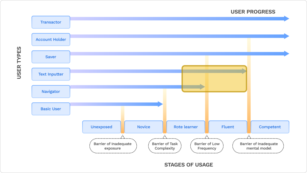
It is clear that there is a barrier of low frequency and the barrier of inadequate mental model
Pros of m-indicator:
Enables users to navigate and find routes effortlessly without relying on text input.
Challenges for m-indicator:
Needs to cater to a wide spectrum of users. From those unfamiliar with Mumbai’s local system to fluent app users who seek quick access to information.
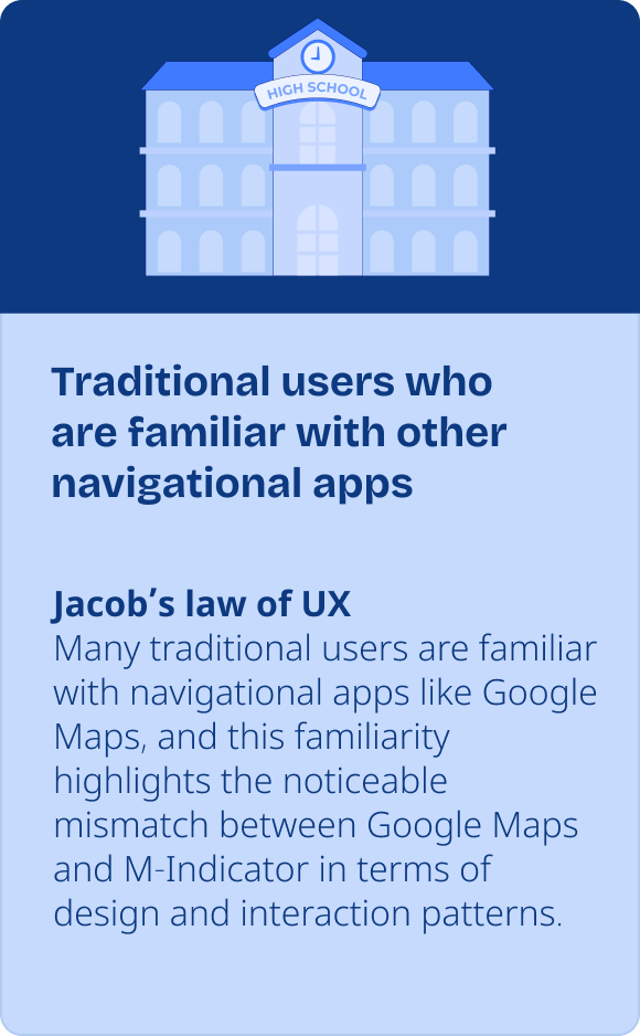
It also has to address the diverse expectations and interaction patterns users carry over from other familiar apps.
It made it obvious who our study users are
Ideal User Selection Graph
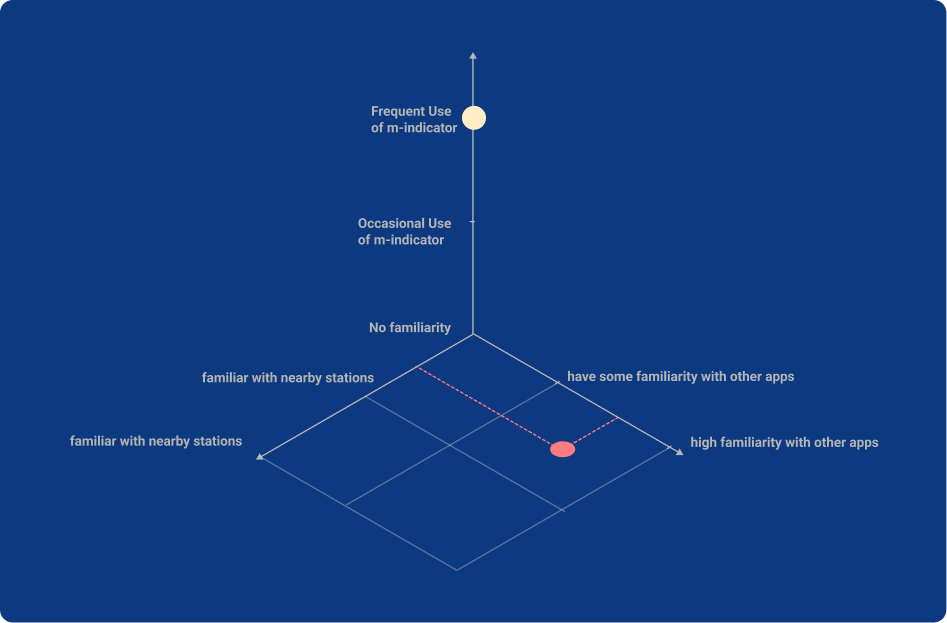
For our study, we selected the users based on these 3 variables.
1
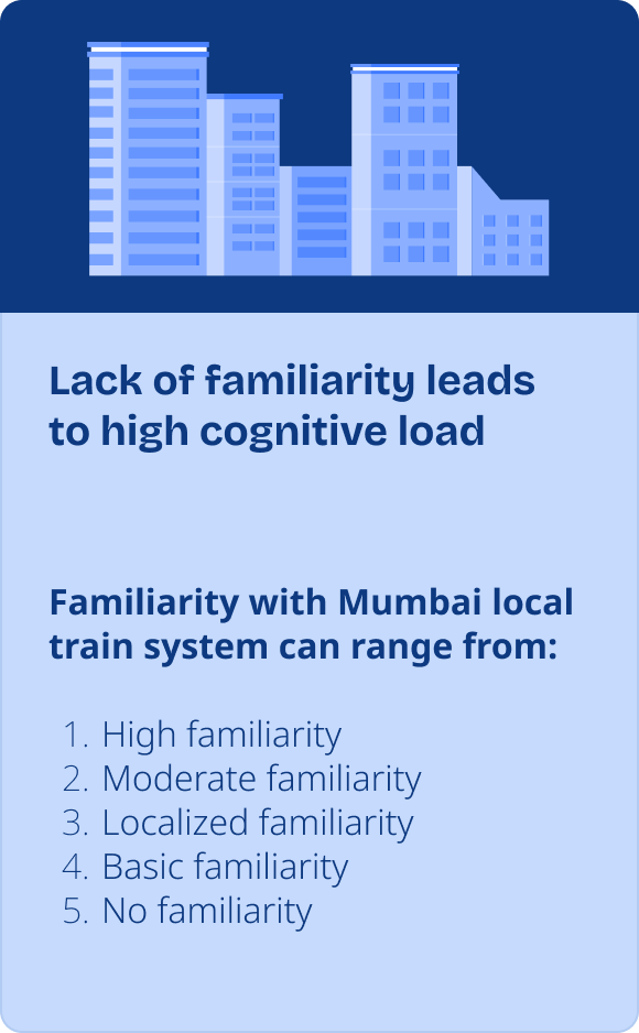
Familiarity with the Mumbai Local train system
The users relay on the app only if they don’t know the local system well
2
Frequency of the M-Indicator app
If they used the app only a few times, they have not internalised the app interactions yet
3
Literacy Level
They should at least understand basic letters in English to use the app.
Redesign for:

Users represented with red dot
- Users with limited familiarity with the Mumbai local train system.
- Users who struggle to build fluency with the existing M-Indicator app and find it difficult to locate or track appropriate trains.
- Users who have familiarity and mental model with other navigational apps and so face challenges adapting to M-Indicator’s interface.
Keep the design similar for:

Users represented with yellow dot
- Users who are regular users of m-indicator
- and users who cannot do text input.
Applying Frameworks
Technology Adoption Model
Areas of improvements
Hierarchal task analysis + Information Architecture
Understanding phase
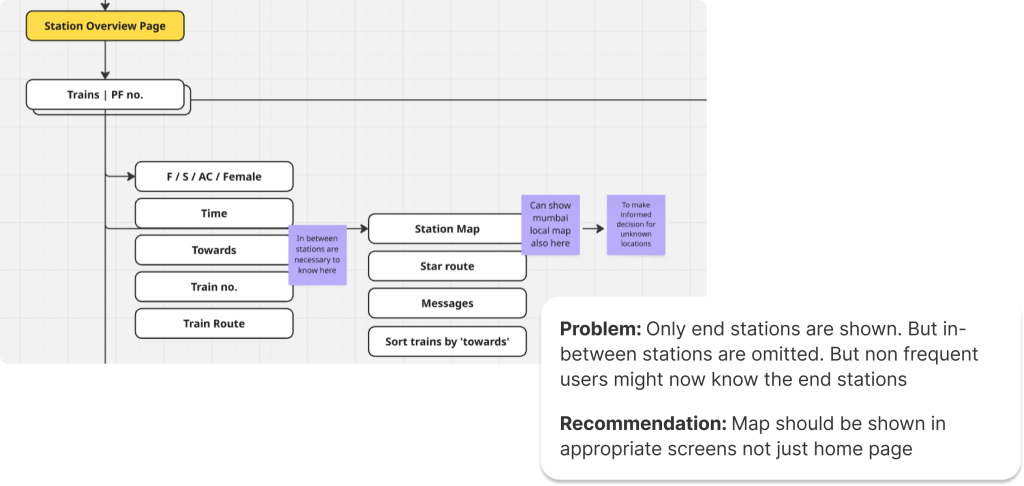
Information Architecture of the App
This IA defines how travel-related information about mumbai locals is organized within m-Indicator.
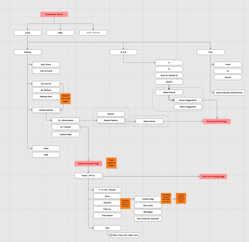
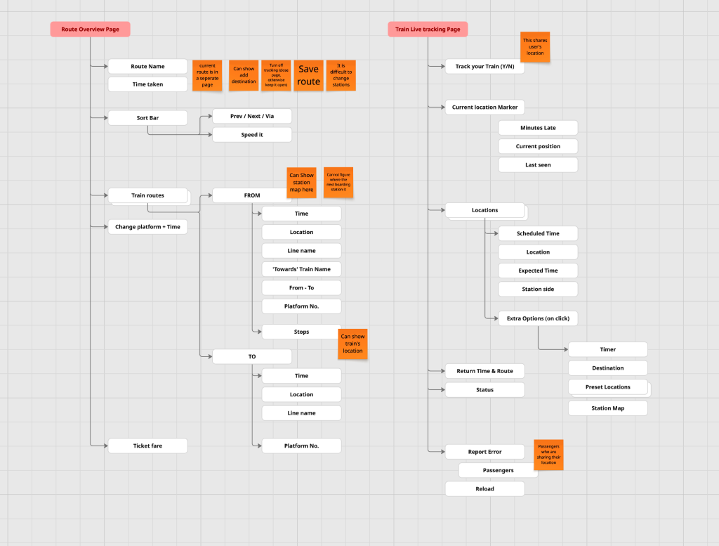
Identifying areas of improvements
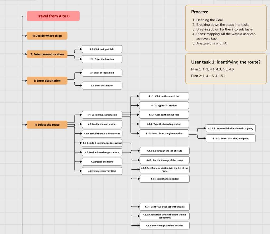
Hierarchal task analysis
Observe → Define main tasks → Break into sub-tasks → Organize hierarchically → Define plan → Analyze.
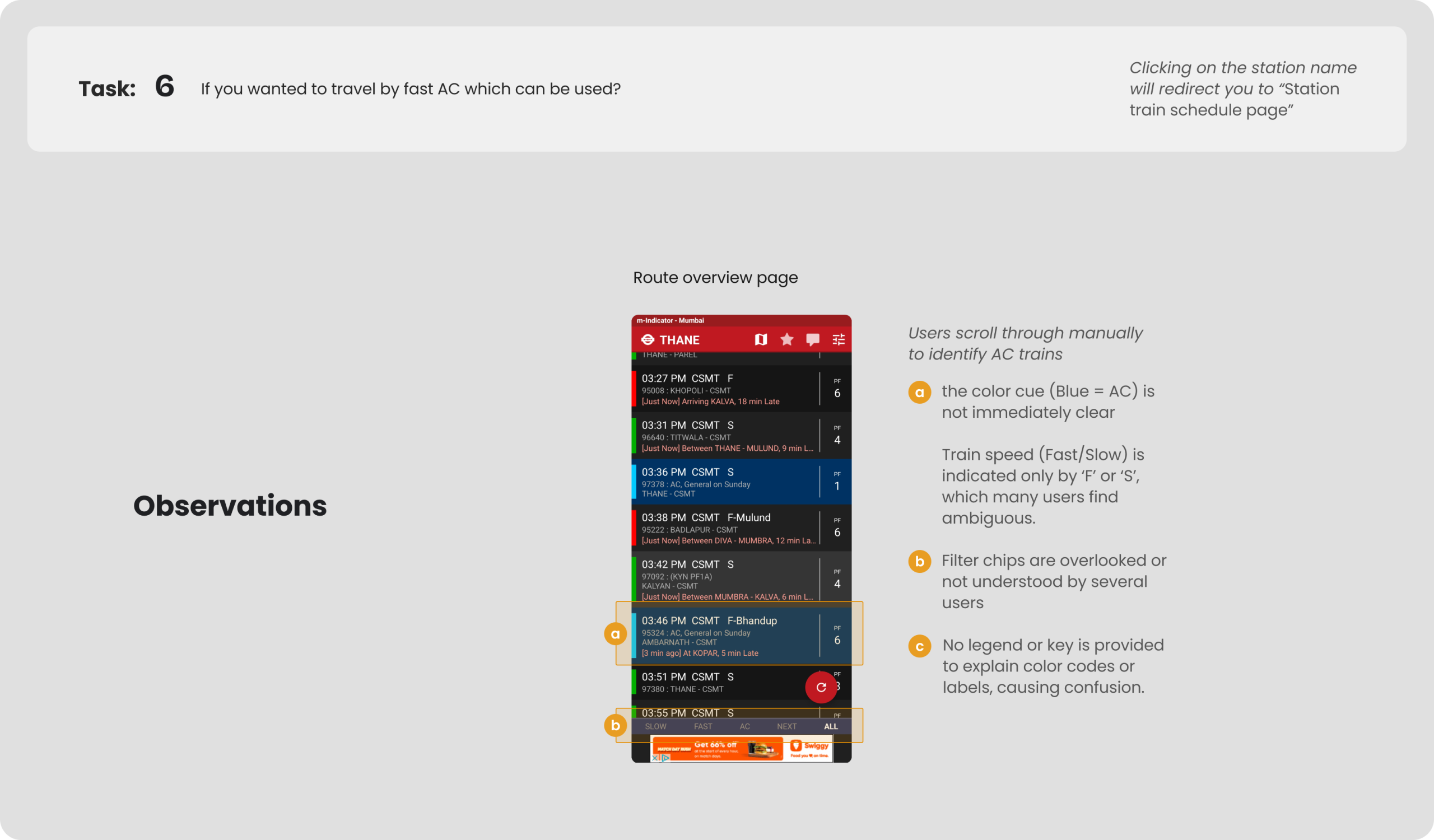
Problems Found
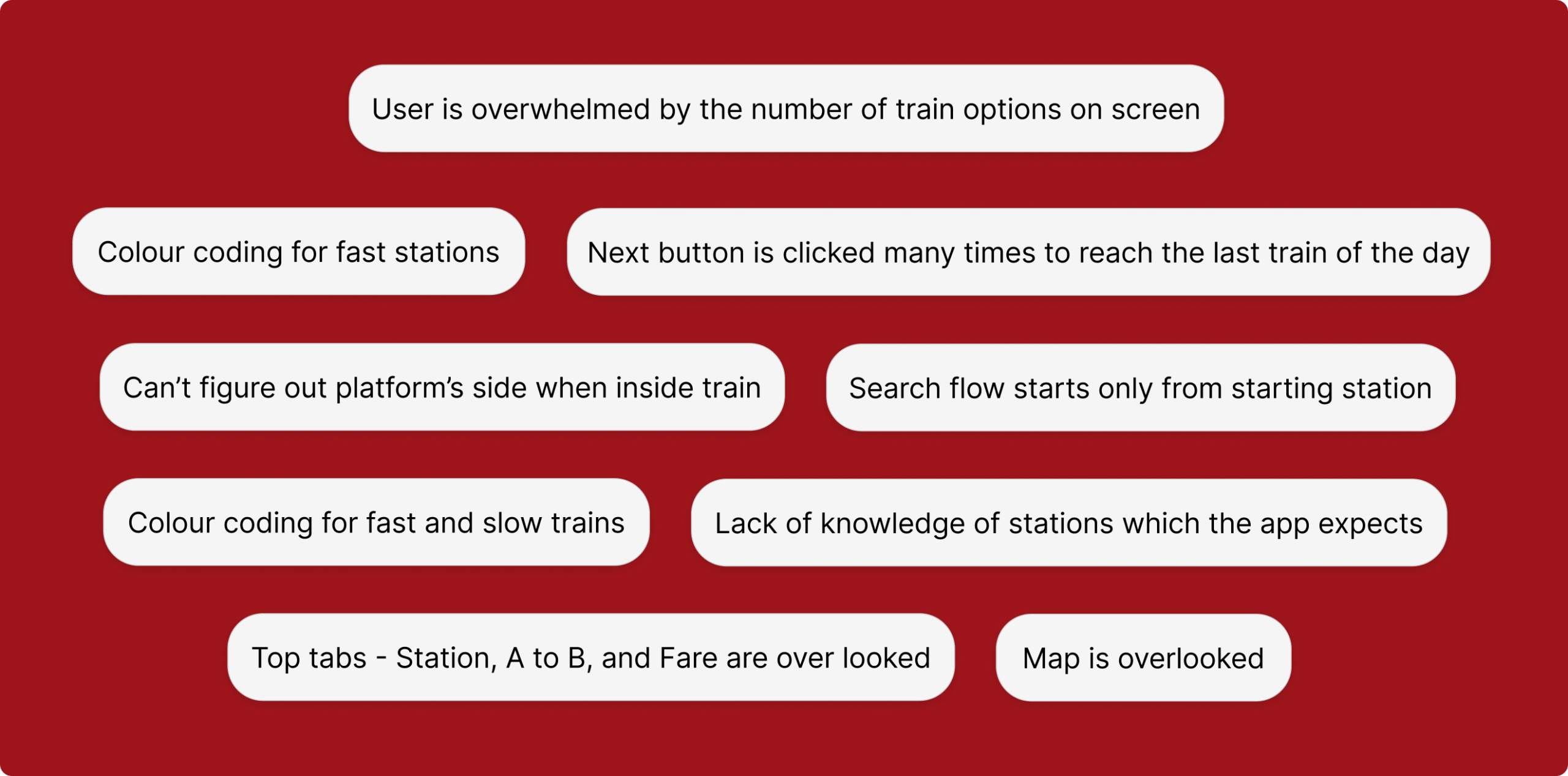
Defining problem
Testing of existing app: By users
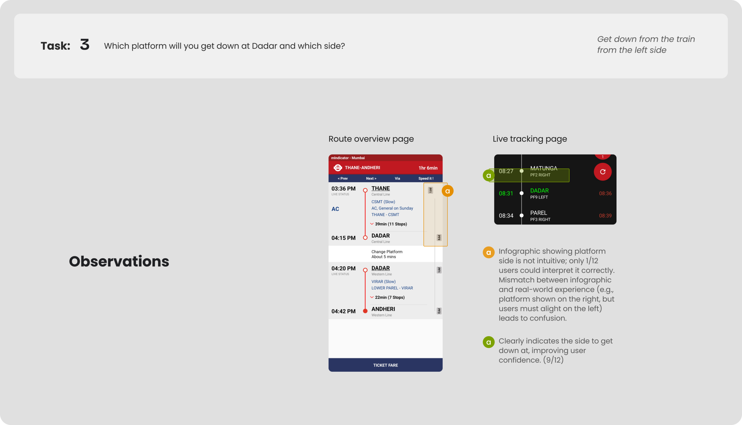
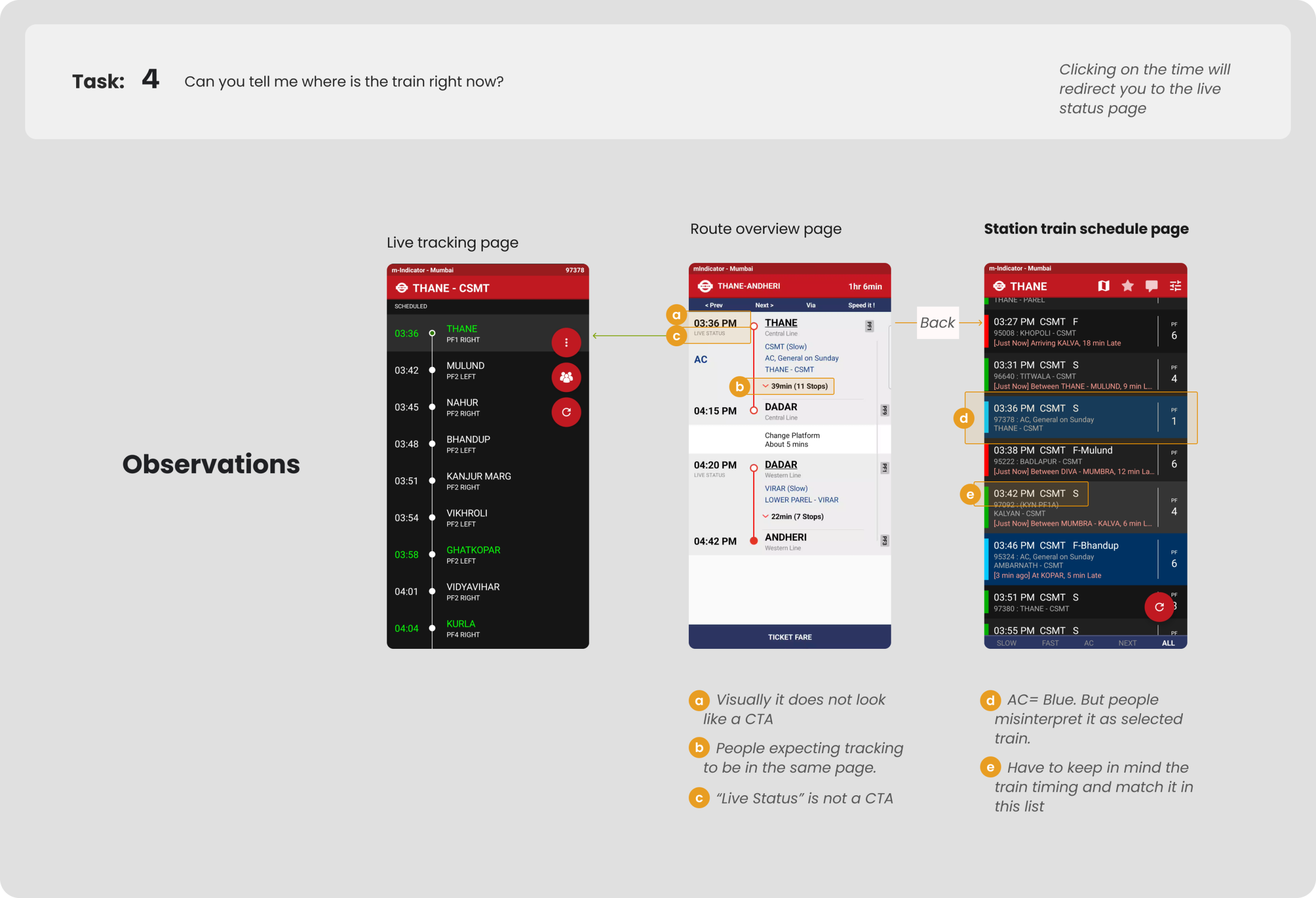
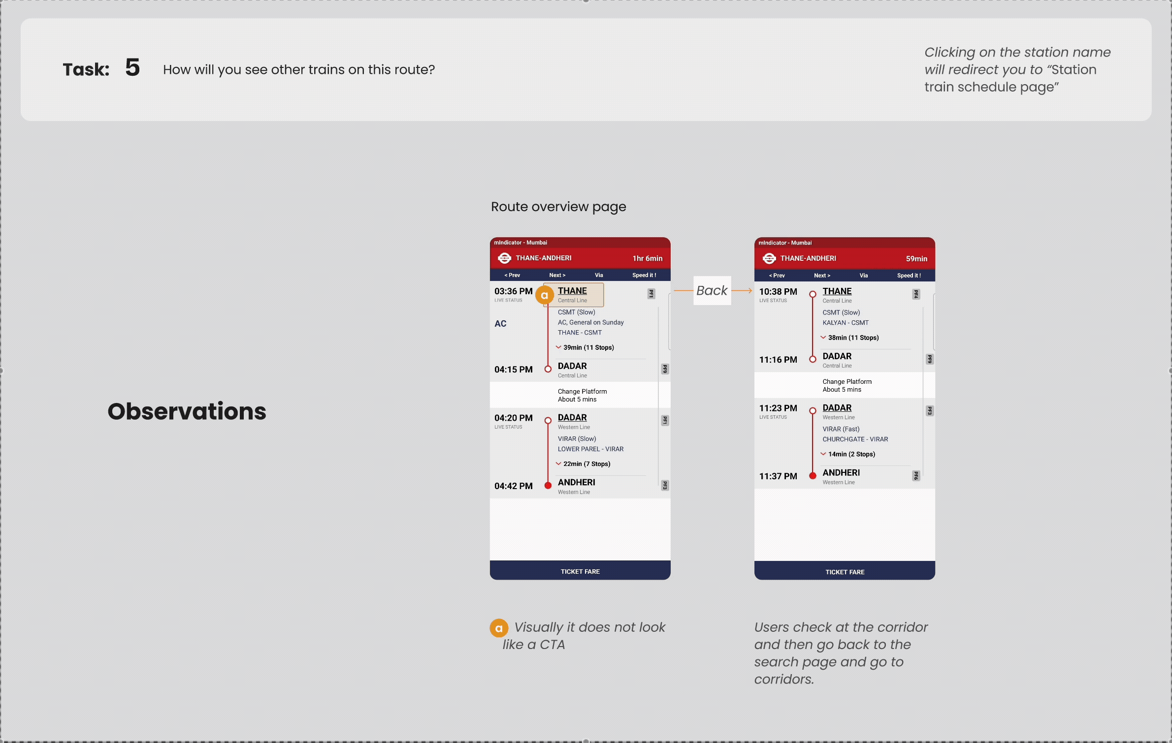
One single task was created – Based on the problems found through qualitative interviews and HTA. This task is broken down into 7 important parts that were most likely to help when you travel in Mumbai Locals.
Context:
Imagine you are in Thane. You have to travel to Andheri. With that in mind, do a cognitive walkthrough of the following.
Redesign Aim
To improve the usability of the M-Indicator app for users with limited familiarity with the Mumbai local train system, through minimal yet impactful design changes.
Part 1
Redesign of the station overview page.
Context:
Imagine you are in Thane. You have to travel to Andheri. With that in mind, do a cognitive walkthrough of the following.
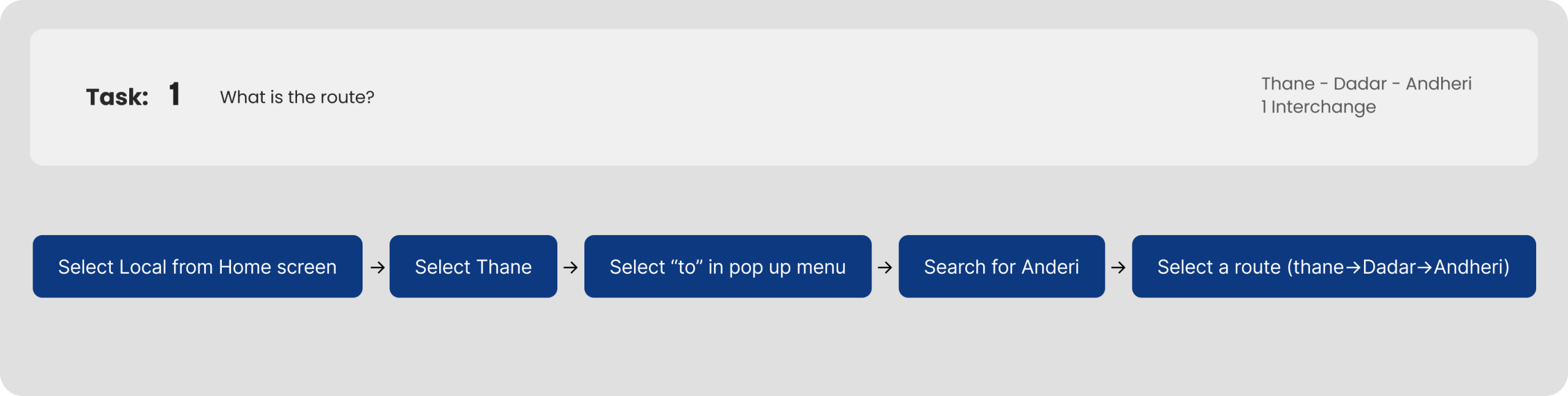
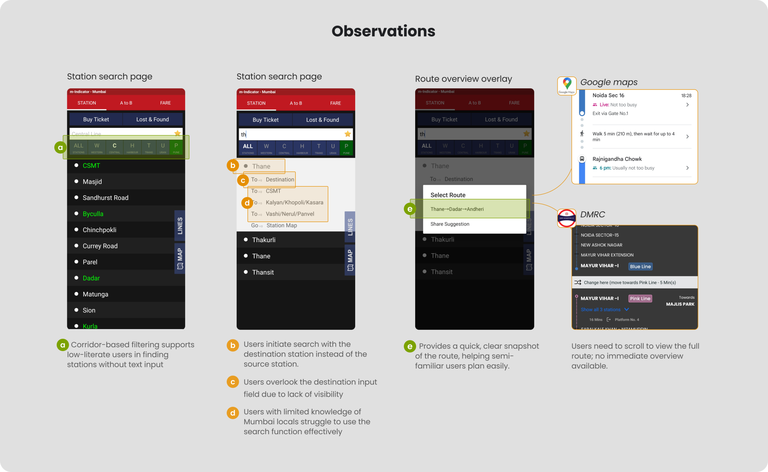
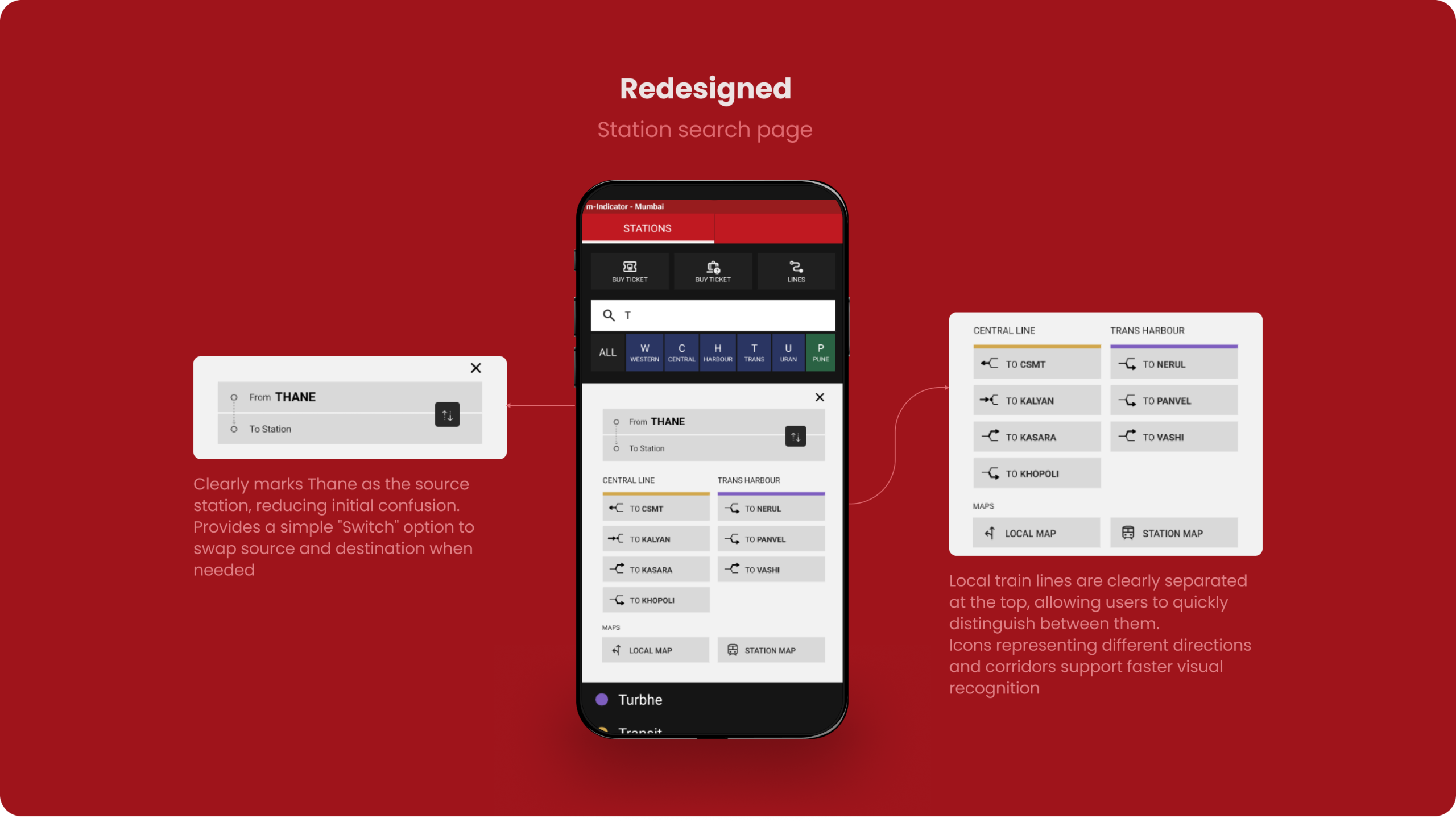
Part 2
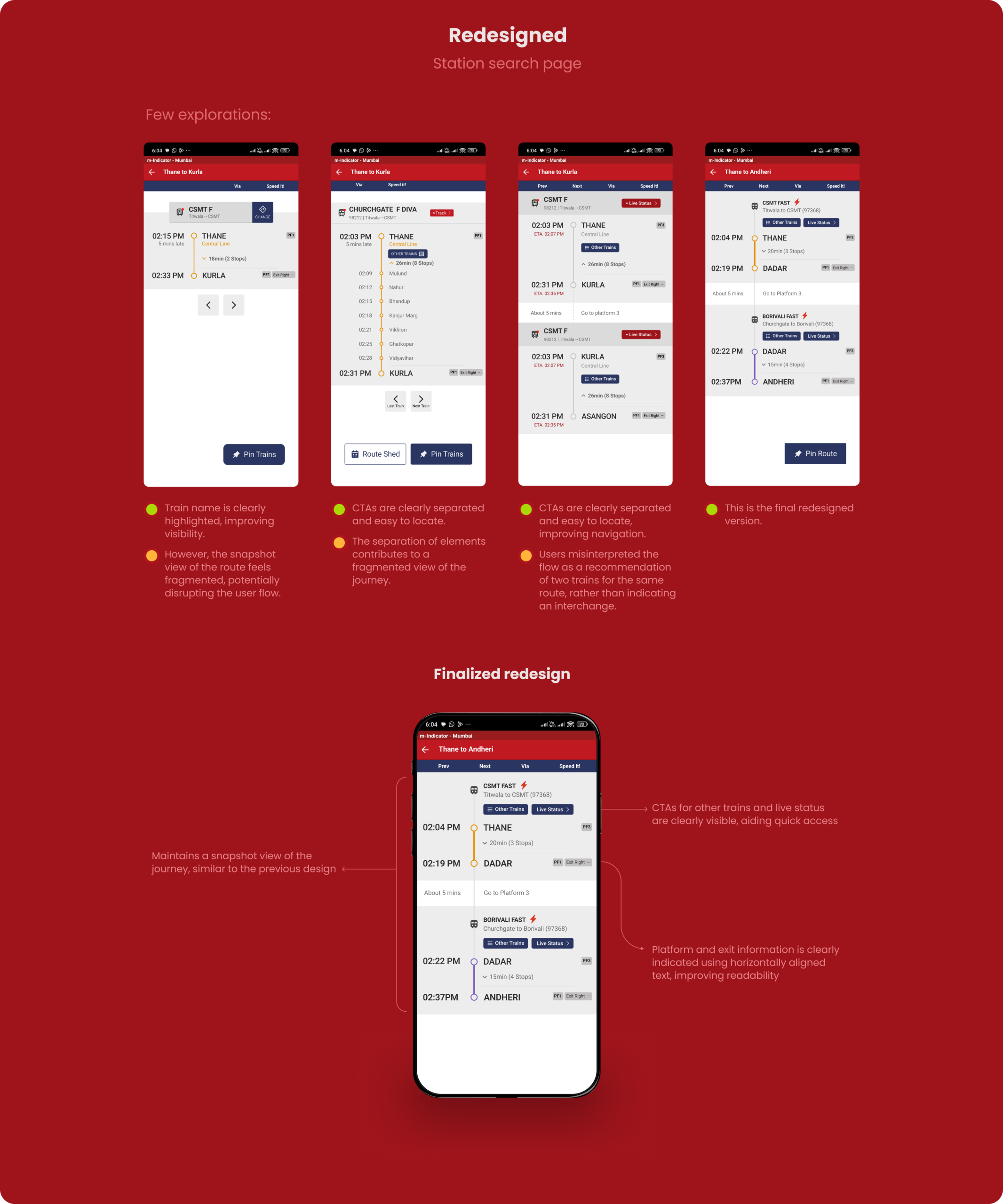
Redesign of the station search page.
Context:
Imagine you are in Thane. You have to travel to Andheri. With that in mind, do a cognitive walkthrough of the following.
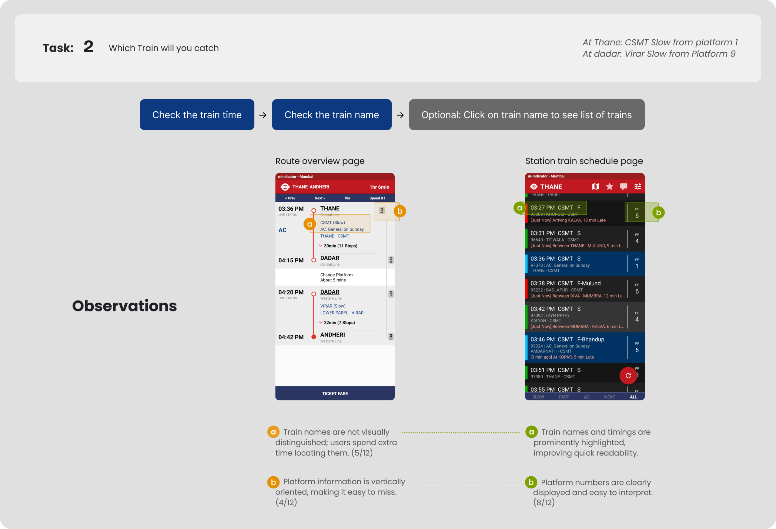
Part 3
Redesign of the station – trains page.
Context:
Imagine you are in Thane. You have to travel to Andheri. With that in mind, do a cognitive walkthrough of the following.
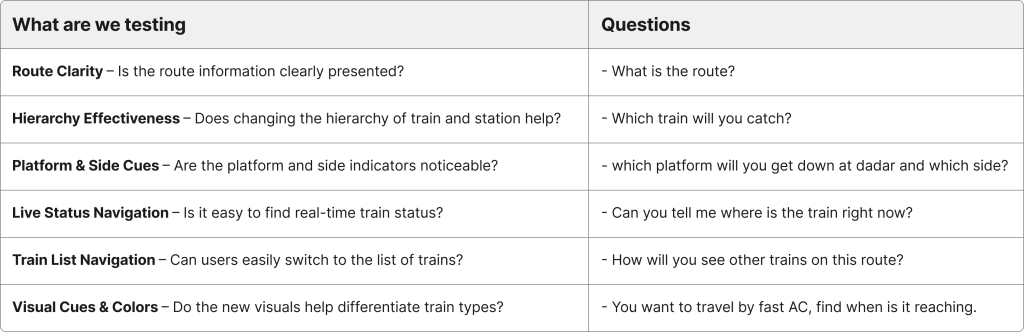
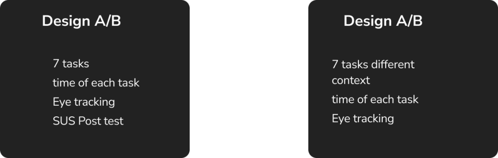
Testing the redesigned app
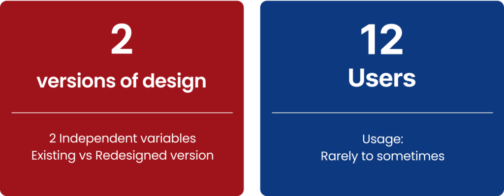
Evaluation Study Setup: Within-Subjects Design
Type of data gathered
Binomial Data:
Task completed or not
calculated as either 1 or 0
Interval Data:
Time to complete the task
in Seconds
The tasks are divided in two types:
Navigation (2/6)
On static screen (4/6)
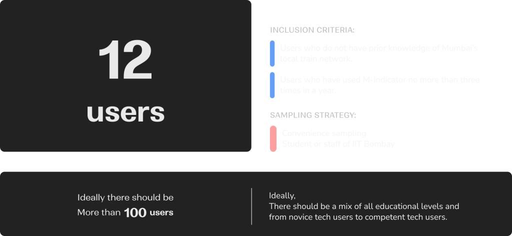
Sampling Strategy
Inclusion Criteria:
The user should have been using m-indicator. If used 2 to 5 times in a month then include.
Exclusion criteria:
If amount of use is once in year, then exclude; if every week then exclude.
Empirical target population:
Sampling Method – Convenience Sampling
Methods
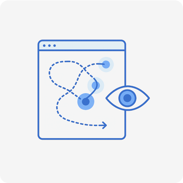
Eye Tracking
& Observation
Eye tracking helped in AB testing. We have used multivariate AB testing to check which set of conditions work better.
SUS, Effectiveness
and Efficiency
Usability Metrics helped to gauge the overall usability. Statistical significance between the two conditions was tested.
Semi structured
interviews post test
Semi-structured interviews helped us gather further qualitative feedback on users’ experience, confusion points, and preferences.
Study Setup
Within Subject Study
(Counter Balanced)
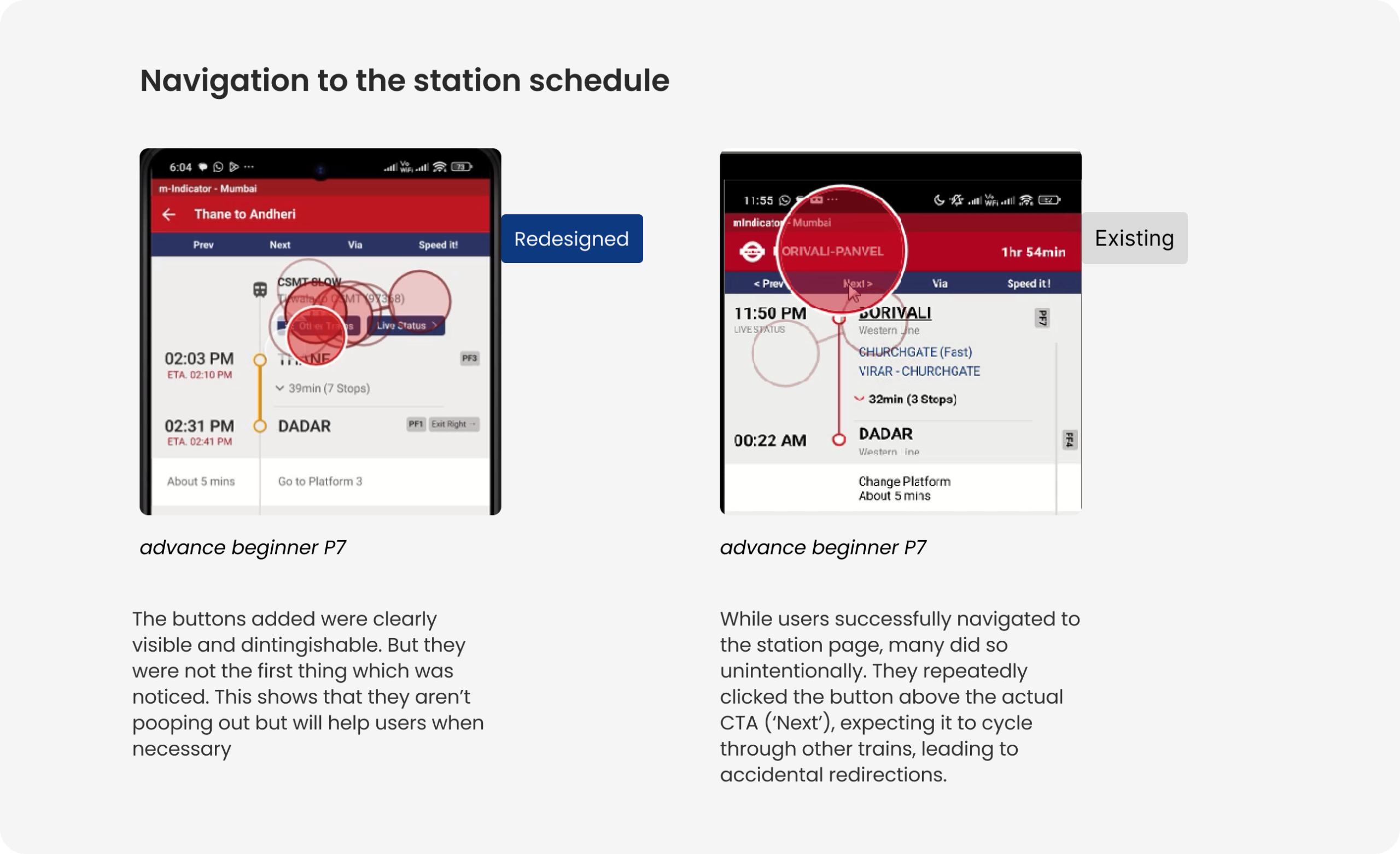
Insights from Eye Tracking

Evaluation
Increase in System Usability Scale
Given the limited time, we tested with a small group. Further testing with more users will help us gather quantitative data to validate and refine the design.
Project Details
m-Indicator
Guided by
Ms. Swati Pal
Collaborators
Krishna Aher
HFID
Eye Tracking
UX Evaluation
Background
During the 2nd semester of Interaction design course at IDC, IIT Bombay, I got to explore how humans interact with systems physically, cognitively and emotionally to understand how products can be designed to fit human abilities and limitations.
Strategy
Conducted exploratory interviews, studied user actions, applied cognitive load theory, Don Norman’s Action analysis, hierarchical task analysis (HTA), cognitive walkthroughs, and user testing with redesigned prototypes. Compared traditional (educated but less adaptable) vs emergent (less formally educated but adaptable) users. This study explores how minimal design changes can significantly impact decision-making while using the m-Indicator app.
Design
Major redesign included clearer route overviews, visible platform information, better labeling of train types (fast/slow/AC), and improved call-to-action buttons (CTAs).
Results
Users were asked to perform train-related tasks (like finding routes, checking live train status, etc.). We conducted a within-subject study comparing existing vs redesigned versions. We used eye-tracking, SUS (System Usability Scale), and qualitative interviews and found major improvements in task completion rate (+27%), efficiency (+55%), and satisfaction (+79%).
Small layout and labeling changes can meaningfully improve navigation confidence.
We found that Low-familiarity users indeed struggled with text-heavy searches and unclear visual hierarchy. The struggle greatly improved on rectifying the issues.
Corridor-based and visually structured information helps overcome literacy barriers.