↓
A fun typeface family that makes a difference
Galatta
(Coming soon)
Aadarsh Rajan
Drawing Office
Typeface Design
Visual Research
Concept Development
Bezier control
Visual Composition
Spacing
I won’t be exaggerating when I say I was that lucky to be part of this project. I was so right at the right place and time that I must have depleted all my luck in getting to be part of this project. Being the first associate at ARDO, I feel like Aadarsh gave me special attention to mould the right skills.
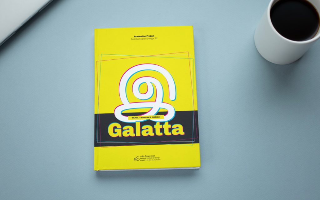
Galatta is a Typeface design project. Galatta (கலாட்டா) is a verb that roughly translates to ‘mischief’ in Tamil is often used to describe kids who are mischievous but also admirable. Needless to say, Galatta also tries to be mischievous with different styles, quirky dingbats & borders and it also tries to be admirable with its user-first design.
Background
During the research & training phase, me and Aadarsh discussed multiple times about the lack of quality Tamil typefaces for books and magazines especially for kids. The older typefaces that currently exist in the market, tend to have not been updated to the latest standards. Many of them have technical problems and design issues. They also tend to be overall serious and sometimes even sinister. When we looked at kids’ books, the typefaces were generic and lack character. This led to the following initial brief of the project.
Strategy
Design a Tamil Uniwidth layered display typeface that has both serif and sans serif typeface styles that take inspiration from the hand-painted traditions from the streets of Trichy. The aim is to design a typeface that looks light-hearted, confident, and playful; a typeface that primarily appeals to kids and one that might be used by graphic designers for children’s book covers, animated shows and school exhibitions.
Later after starting the project, after understanding the scope of the project, the brief was expanded.
The brief was then, design a multilingual (Latin and Tamil) uniwidth typeface in multiple weights with an upright version and an slightly oblique version with multiple layers in both serif and san-serif styles. The aim is to make the typeface light-hearted, playful and confident that primarily appeals to kids. The typeface should be used by graphic designers and comic artists on various digital and printed mediums.
Design
The typeface is designed across two sub families: Galatta Display and Galatta text. Each sub family comes with at least 5 weights: lively and fun in bolder weights but neutral enough in its lighter variants. Punchy strokes weren’t limited to grids but were be meticulously constructed with rounded corners, and feathery curves with a slight bounce.
The typeface is UNIWIDTH, which means it doesn’t reflow on changing the weight. More effects like ornaments, dingbats, styled underline and borders were added. The typeface works as a web font and is specially optimized for print text sizes.
Get yourself a copy
Concept
Galatta’s glyphs are spongy and resemble squircles with round & triangular corners that are both soft on the eye and appealing to kids. Galatta also has features fit for the meaning of its name.
Release
Galatta’s design process has its own challenges like any other typeface design. As much as I like to brag about it, it’s only halfway done. Aadarsh, my mentor who taught me and chiselled my skills is currently working on the Latin counterpart of the Tamil design. I’m fairly certain we can see the text version of Galatta in online stores within the next few months!
Fingers crossed 🙂
Project Under NDA
More details about the project will be available once the beta version of typeface is released to the public
Until then you can request a copy of my well-documented graduation project document. Both digital and physical copies are available.
Note: Physical copy of the document will include the printing and shipping cost.
Project Details
Galatta
(Coming soon)
Aadarsh Rajan
Drawing Office
Typeface Design
Visual Research
Concept Development
Bezier control
Visual Composition
Spacing
Background
During the research & training phase, me and Aadarsh discussed multiple times about the lack of quality Tamil typefaces for books and magazines especially for kids. The older typefaces that currently exist in the market, tend to have not been updated to the latest standards. Many of them have technical problems and design issues. They also tend to be overall serious and sometimes even sinister. When we looked at kids’ books, the typefaces were generic and lack character. This led to the following initial brief of the project.
Strategy
Design a Tamil Uniwidth layered display typeface that has both serif and sans serif typeface styles that take inspiration from the hand-painted traditions from the streets of Trichy. The aim is to design a typeface that looks light-hearted, confident, and playful; a typeface that primarily appeals to kids and one that might be used by graphic designers for children’s book covers, animated shows and school exhibitions.
Later after starting the project, after understanding the scope of the project, the brief was expanded.
The brief was then, design a multilingual (Latin and Tamil) uniwidth typeface in multiple weights with an upright version and an slightly oblique version with multiple layers in both serif and san-serif styles. The aim is to make the typeface light-hearted, playful and confident that primarily appeals to kids. The typeface should be used by graphic designers and comic artists on various digital and printed mediums.
Design
The typeface is designed across two sub-families: Galatta Display and Galatta text. Each sub family comes with at least 5 weights: lively and fun in bolder weights but neutral enough in its lighter variants. Punchy strokes weren’t limited to grids but were be meticulously constructed with rounded corners, and feathery curves with a slight bounce.
The typeface is UNIWIDTH, which means it doesn’t reflow on changing the weight. More effects like ornaments, dingbats, styled underline and borders were added. The typeface works as a web font and is specially optimized for print text sizes.
“Type design is an elegantly organized solution to a fundamentally messy problem.”
– Erik Spiekermann