↓
Book cover that makes the first impression clear
Shadows across the playing field
Roli Books
Concept Development
Vector Illustration
Typography
This redesign project focuses on creating a captivating book cover for “Shadows Across the Playing Field.” The aim is to visually convey the complex relationship between cricket, politics, and diplomacy in India and Pakistan, all while celebrating the talents of the cricketers who have captured hearts on both sides of the border.
This is part of the design internship at Roli Books.
Background
The book “Shadows Across the Playing Field” provides a unique perspective on the intricate relationship between cricket, politics, and diplomacy in India and Pakistan. However, the existing book cover failed to effectively convey this complex narrative to potential readers.
The issues with the previous cover were multifaceted. Firstly, it lacked clarity in its messaging. The use of the colour green, although symbolising cricket, made the cricket ball on the cover less recognisable, diminishing its visual impact. This obscurity meant that at first glance, potential readers might not readily understand that the book primarily revolves around cricket.
Secondly, the size of the authors’ names, Shashi Tharoor and Shaharyar Khan, was relatively small, failing to give them the prominence they deserved. Given their deep knowledge of subcontinental politics and diplomacy, their names should have been a central feature of the cover.
Lastly, while the previous cover subtly hinted at the two sides with the use of orange and green, it did not effectively communicate the gravity of the intertwined relationship between cricket and politics. It lacked the visual depth needed to convey the layers of this relationship, which are central to the book’s narrative.
Strategy
The strategy for this redesign project was clear: to address the issues with the previous cover and create a design that not only clearly communicated the book’s central theme but also gave due prominence to the authors, Shashi Tharoor and Shaharyar Khan.
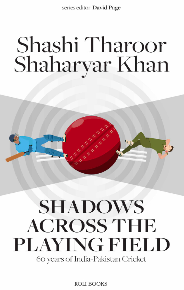
To tackle the problem of recognition, I opted for a design that prominently featured a cricket ball at its core. This instantly identifies the book’s subject matter and serves as a visual anchor for the viewer.
To enhance the visibility of the authors’ names, I decided to make them more prominent, ensuring that their contributions to the book’s content and their expertise in subcontinental politics and diplomacy were immediately evident.
In terms of design, I aimed to create a cover that went beyond symbolism and directly conveyed the complexity of cricket’s intertwining with politics. This meant incorporating multiple layered circles surrounding the cricket ball, representing the layers of the game, and the shadows cast by its political aspects.
Design
The overarching concept for this book cover redesign is to create a visually engaging representation of the intricate relationship between cricket, politics, and diplomacy in India and Pakistan. The design aims to captivate the viewer while clearly conveying the book’s central theme. It also seeks to provide a fresh and distinctive visual identity for the republished edition by Roli Books.
Details
Cricket Ball as the Focal Point:
At the heart of the design is a cricket ball, serving as a powerful and immediate visual anchor. This cricket ball symbolizes the essence of the book – cricket – and ensures that the subject matter is unmistakably clear to potential readers.
Players on opposite side in a shadow
The ball is casting a shadow on either side showing that the people supporting are in the shadows while there is a lot of political situations deep in play when the players are on the ground
Multiple Circles Representing Layers:
Surrounding the cricket ball are multiple concentric circles. These circles represent the various layers of the game and the shadows cast by its political aspects. They visually convey the complexity of cricket diplomacy, highlighting how cricket transcends sport and becomes intertwined with political and diplomatic affairs.
Color Palette:
The color palette for the design is carefully chosen to evoke the cultural and national identities of India and Pakistan. Subtle use of orange and green, the respective colors of the two nations, helps reinforce the idea of two sides coming together on the cricket field.
Prominent Author Names:
Shashi Tharoor and Shaharyar Khan, the authors of the book, are given due prominence on the cover. Their names are displayed prominently, recognizing their expertise in subcontinental politics and diplomacy, and their role in crafting the book’s narrative.
Typography:
The typography is carefully chosen to be clear and legible while also conveying a sense of depth and complexity. It complements the overall design, ensuring that the title, author names, and other textual elements are seamlessly integrated into the composition.
The Previous Cover
It’s actually great!
The old design shows a very deep meaning behind the colours, like a cricket ball lost in the grass conveying the deep connection between cricket, politics, and diplomacy.
The only problem was that the usage of colors on the ball obscured the look of the cricket ball itself and failed to highlight the main selling point of the book, that is Shashi Taroor and Shaharyar Khan.

The final covers
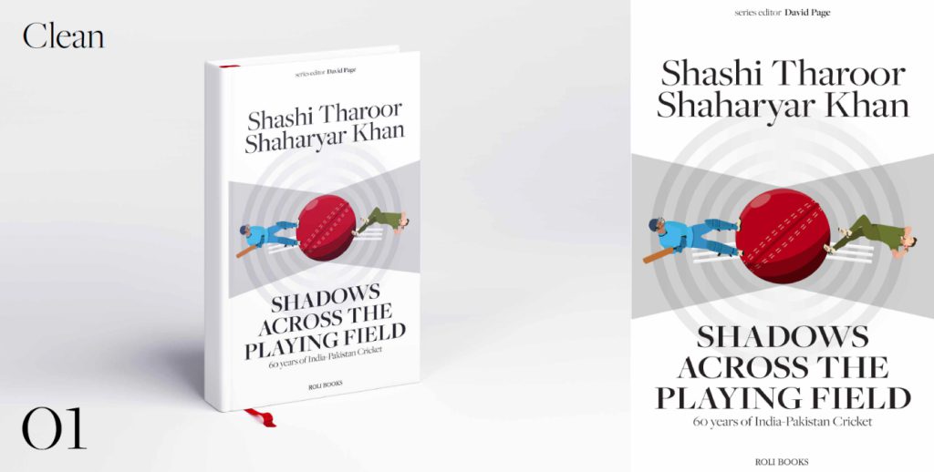
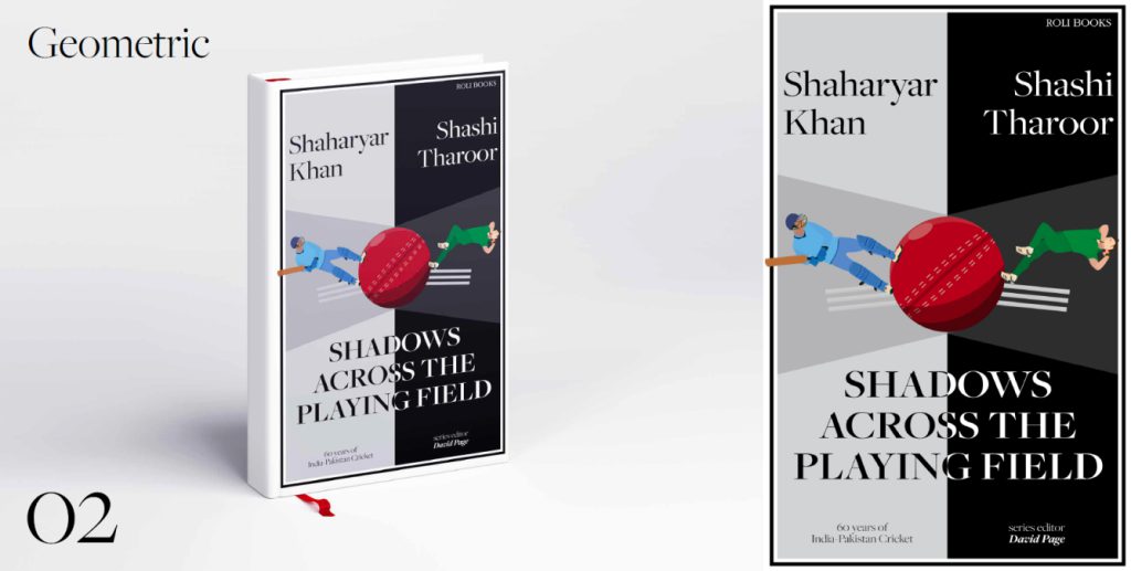
There are Two!
This project
It taught me the importance of balancing creativity with clarity in design. It also emphasised the significance of effective communication through visuals.
In the Process
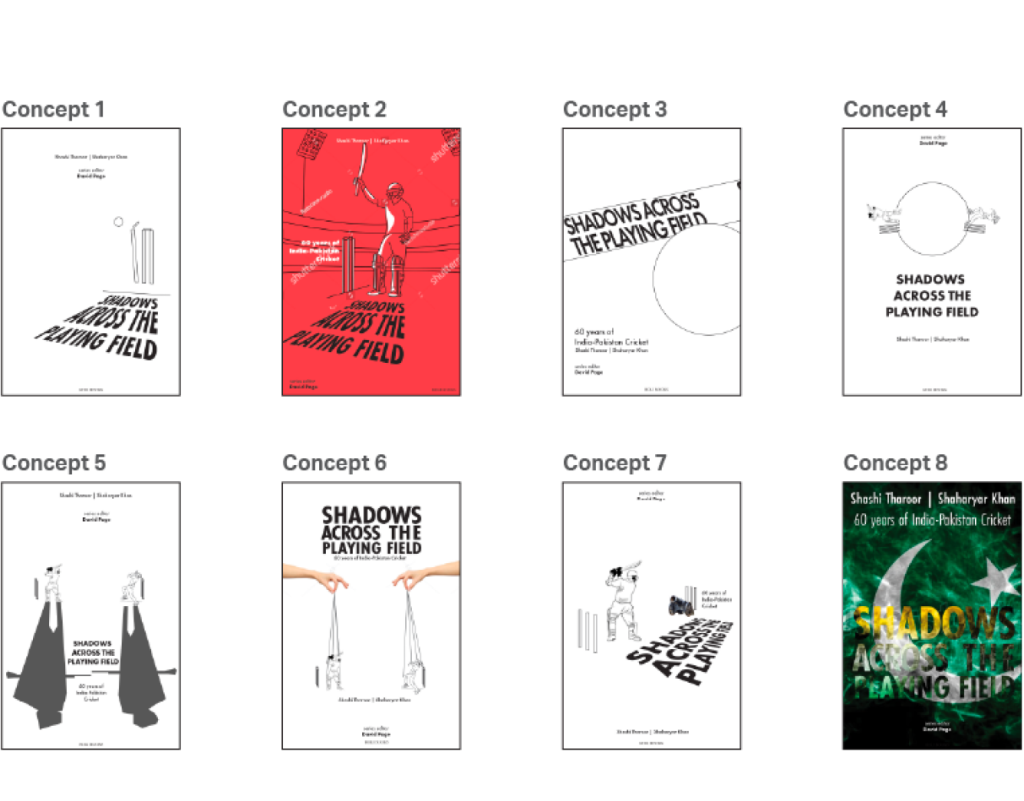
The Proposed concepts
My Takeaway
This redesign project not only enhanced my design skills but also allowed me to contribute to the book’s message by creating a cover that succinctly captures the essence of cricket’s role in diplomacy and politics in India and Pakistan.

“A well-designed book cover can become an iconic symbol of the story it represents.”
– John Green
Project Details
Shadows across the playing field
Roli Books
Concept Development
Vector Illustration
Typography
Background
The book “Shadows Across the Playing Field” provides a unique perspective on the intricate relationship between cricket, politics, and diplomacy in India and Pakistan. However, the existing book cover failed to effectively convey this complex narrative to potential readers.
The issues with the previous cover were multifaceted. Firstly, it lacked clarity in its messaging. The use of the colour green, although symbolising cricket, made the cricket ball on the cover less recognisable, diminishing its visual impact. This obscurity meant that at first glance, potential readers might not readily understand that the book primarily revolves around cricket.
Secondly, the size of the authors’ names, Shashi Tharoor and Shaharyar Khan, was relatively small, failing to give them the prominence they deserved. Given their deep knowledge of subcontinental politics and diplomacy, their names should have been a central feature of the cover.
Lastly, while the previous cover subtly hinted at the two sides with the use of orange and green, it did not effectively communicate the gravity of the intertwined relationship between cricket and politics. It lacked the visual depth needed to convey the layers of this relationship, which are central to the book’s narrative.
Strategy
The strategy for this redesign project was clear: to address the issues with the previous cover and create a design that not only clearly communicated the book’s central theme but also gave due prominence to the authors, Shashi Tharoor and Shaharyar Khan.
To tackle the problem of recognition, I opted for a design that prominently featured a cricket ball at its core. This instantly identifies the book’s subject matter and serves as a visual anchor for the viewer.
To enhance the visibility of the authors’ names, I decided to make them more prominent, ensuring that their contributions to the book’s content and their expertise in subcontinental politics and diplomacy were immediately evident.
In terms of design, I aimed to create a cover that went beyond symbolism and directly conveyed the complexity of cricket’s intertwining with politics. This meant incorporating multiple layered circles surrounding the cricket ball, representing the layers of the game, and the shadows cast by its political aspects.
Design
The overarching concept for this book cover redesign is to create a visually engaging representation of the intricate relationship between cricket, politics, and diplomacy in India and Pakistan. The design aims to captivate the viewer while clearly conveying the book’s central theme. It also seeks to provide a fresh and distinctive visual identity for the republished edition by Roli Books.
“A book cover is a distillation. It is a haiku of the story.”
Chip Kidd